
A chat on Facebook — one of those ones where the contributors attempt to find common ground— came up with a suggested factoid, that there have been more deaths due to 'flu this year than due to C-19. A number of related posts (i.e., similar subject, no noted common people) echoed this. Whether that was separately coming to the same conclusion or the one idea bouncing around, I cannot tell.
The first source to look at has to be the ONS, which keeps and publishes all sorts of data like that. There is a mass of data available, but finding some that is relevant is less easy.
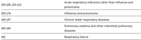
To compare COVID-19 with other causes of death we use leading cause groupings. The Office for National Statistics’s (ONS’s) leading causes of death groupings are based on a list developed by the World Health Organization (WHO). This categorises causes of death using the International Classification of Diseases, tenth edition (ICD-10) into groups that are epidemiologically more meaningful than single ICD-10 codes, for the purpose of comparing the most common causes of death in the population. [2] This [2] gives stuff to June 2020, mostly on Covid. The 'leading causes' list, section J, is copied here, from [3]. Covid, in this framework, is U07.1 and U07.2
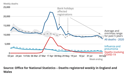
The top graph in red and blue compares Covid with influenza and all deaths, but note that 'flu is category J09-18, conflated with pneumonia. So we cannot tell if the flu is worse than covid in terms of count. A death can be registered with both COVID-19 and Influenza and Pneumonia mentioned on the death certificate. Because pneumonia may be a consequence of COVID-19, deaths where both were mentioned have been counted only in the COVID-19 category. Data of this type is crude, in the sense that a cause mentioned on the death certifcate is what drives the data acquisition. There is maximisation of the Covid death count, as an effect of the national level concern.
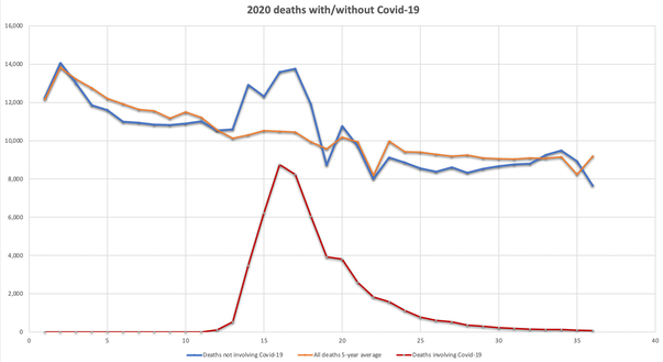
These two graphs here were made by me from the ONS data, [Fig 2 of source 4, then Fig 7]. Week numbers on x-axis, death count on y-axis. Week 16/17 is the end of April. This is England and Wales, but the English preponderance, 86% of people in England over the UK, means that is the bulk of cases anyway. And England, one has noted often, is far more struck by the pandemic.
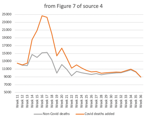
The figures given in the data do not always agree; for example, the covid deaths quoted in graphs Fig 2 and Fig 7 of [4] differ by about the same (5000 by Week 33) as the reduction caused by counting 'deaths within 28 days of a positive covid test' as published later. The non-covid deaths in grey shows far less surge in weeks 14-19 (shown here from Fig 7 of source 4). I added covid deaths so as to produce 'all deaths' as the orange line. The maximisation of the covid count, discussed above, applies.
In the longer term, the ONS will, I'm sure, abstract the figures to allow comparison of influenza (and pneumonia) with Covid. Meanwhile, this is what I have managed, to date. I loved the typo that turned mortality data into a graph about morality (or its lack). Which we measure by the extent to which we fail to keep our politicians behaving properly.
DJS 20200917
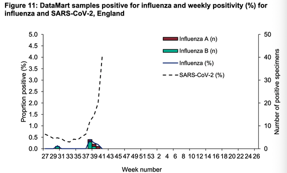
Edit 20201018 From week 40 the weekly report on Covid is to be combined with that for influenza so as to report on respiratory viruses. That does not mean that covid and influenza are confused, only that the reporting will occur in the same document. Wk 41 link.
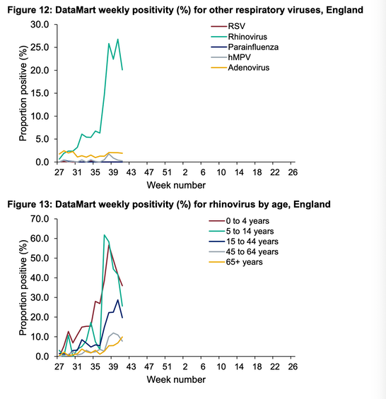
Differences from the Wk40 report were noticed by me on P16, such as this chart, Fig 11, weekly positivity for the shown respitratory diseases. Rhinovirus, rampant through school age children was very much higher, as shown.
PHE also publishes. Here's Week 42, running up to 12th October, which I rate as pretty immediate supply of reporting. Less useful, to my mind, is the summary report, for which I can link week 43. Which was updated 20201001 but is dated also as being up to 20191020, A year earlier. These summary reports are produced every even numbered week, and more in arrears, such that today (18th) the most recent available is from the 1st, last published on the 10th.
[3] leading causes list https://www.ons.gov.uk/peoplepopulationandcommunity/birthsdeathsandmarriages/deaths/methodologies/userguidetomortalitystatistics/leadingcausesofdeathinenglandandwalesrevised2016
Related pages:
Essay 291 - Effects of an outbreak what it says, effects, but some description of what we have (and not)
Coronavirus (Y10+) modelling problems
Epidemics more general theory
Infectious disease looking at the 2020 problem, particularly effects of the reproduction number changing.
Essay 298 Covid Consequences surprisingly prescient, considering when it was written.
Essay 304 Covid Disparities A report on the report, including what it doesn't say.
Essay 316 Covid in September this very page
Viruses are very small worth reading, I think.