
Given that our society is now declared to be ‘post-truth’, I have been wondering why that is. One aspect of the problem is the inability to process statistics. Yet again, as soon as I have had the idea to write, the Guardian Long Read ¹ strikes at the same matter with remarkable synchronicity. This time the paper got there first, by about a week, but I discovered that position after I’d written much of what I have to say. This effort was then edited to reflect not so much the Long Read’s content ² but the comments that followed it.
I have complained on these pages far too often that the press fails us as a source of information. It is not as bad as the visual media, but it is still failing to, for the most part, explain to those of us who really want to know about a topic.
Taking any so-called statistics as an example, I used to say at the start of any course in Stats (and therefore the start of descriptive stats) that there are two measures; location and spread. By pairing these I hoped that students would recognise the need for both, but I didn’t labour that and maybe I should have, because that lies at the root of the current observed failure to comprehend numbers. Hard on the heels of that two-part description is that statistics are, in general, used to condense a mountain of data into a (small) group of numbers that describe the data (properties of the data or its distribution).
What goes wrong, especially when such folk as politicians and members of the press are included, comes in several parts:
(i) the perception that the audience is not only stupid but completely unable to comprehend numbers reduces all use of figures to less than the minimum necessary. This is not at all helped when the quoted numbers are only transmitted orally (and so received aurally). Many of us do genuinely have difficulty holding such numbers in our head for long enough to process them helpfully.
(ii) the numbers themselves are often, because of (i), delivered without the many caveats that indicate exactly what was measured, processed, etc and that includes access to the original data.
(iii) most of the time what is suppled is one of the measures of location, probably called ‘average’, when we know (‘cos we’ve all done GCSE Maths at some level) that there are three averages. Some of us even know that they can be quite well separated, such as the median and mean of an asymmetric distribution (such as personal income across the nation). ⁴ Most of us once knew—and, if challenged to think, would remember—that a median is the middle number (when in order), so we understand that half of the population (of the data) is below the median and half above. So, for example, we actually understand that half of the population of the nation has pay below the national average; if they didn’t, it wouldn’t be a median. For that income distribution, indeed, we might expect the mode to be at or close to the minimum wage and for the mean to be embarrassingly high (ambition for A-level students might include eventually having pay above the national mean!!).
(iv) Statistics applied to something large like a nation are unlikely to explore local effects. This means that the general comment can all too easily conflict with local (personal) knowledge, so, because the ancillary descriptors are missing, this makes the audience disagree with the numbers quoted. Of course you do, unless you happen to live in a place that accidentally models the ‘average' for this particular issue.
We have several sub-issues, one of which is that people expressing opinion, especially people being paid to move opinion in a particular direction, will never agree with the stats used by the ‘opposition’. Their first objective is to discredit the numbers. There are many ways to do this and they are the subject of the school subject Critical Thinking (but only where that is accurately titled, not Use of English in disguise, though that too is a good subject to follow).
Looking for examples to demonstrate at least some of these issues, I found myself casting back to the Brexit referendum, its reporting and the failure of communication of numbers. Take, for example, the perception that there are many European migrant workers in Britain, where it is those from Poland who were singled out for unfair and unwarranted vilification.
Leaving aside how it is that they are identified and isolated as a community, it should be noted that to understand any figures for employment as quoted by the ONI we need to understand what employment is. Easy, you say, someone gets paid for doing work: Try these questions:
(i) How much work would you do to be included in the stats as being employed?
(ii) How much work do you need to have done to not need government support?
(iii) If a PhD-holder is on minimum wage is that not also underemployment?
(iv) Are those who are retired included in the potential workforce?
(v) When does a migrant worker qualify for inclusion in the workforce?
Notice the difference between being unemployed or underemployed. Notice how thoroughly one needs to understand what employment is or is not before being able to use some statistics to support an argument.
As for the use of statistics in political discussion, meaning political in its widest sense and especially when intending to discuss such things in front of an audience, then if it was my show to run, there would be a previous discussion in which the parties agreed upon common facts. ³ Then we might precede argument with a dissertation from an apparently independent source such as perhaps the broadcaster. What I find completely useless is when the initial content is already filtered through some political bias. I find myself in frequent agreement with, for example, Nigel Farage and Boris Johnson. By which I mean, if I was in their position I would quite probably say something similar. The reaction(s) that the press as a whole delight in feeding off is, from my perspective, useless froth when I would far prefer that the press made at least some attempt to discover some news of relevance. For example, we have a dearth of certain vegetables, where I noticed the lack of broccoli but not that of courgettes. I see this week there is no blue-topped milk in (two different) supermarkets – now that, to me seems worthy of proper investigation, including explaining where these foods come from, what the problems are, where else we might find such or what we might substitute for it. I’d even say this justifies lead in the national news. But no, this week we have Boris complaining that the Europeans wish to beat us up in the style of a sit-com, for which he is accused of calling them Nazis (he didn’t use the word at all) and page after page of ‘reaction’. Not even worth a teacup to put the storm in.
DJS 20170124
I discuss much the same matters from a different perspective in several other essays:
199 - The Press is the Enemy
185 - Free Speech isn’t
175 - More on Migration
174 - UK Illegal Immigration
173 - Migration 1
Thanks to Adam Stonehouse for the introduction to Jonathan Pie, to whom I may need to put links where we coincide on topics at which to rant. Wikipedia entry. For those outside Britain, you need to remember just how extreme British humour can be when measured against your own national humour. Americans may prefer Bill Maher.
top pic from izquotes.com. Quote is from either or both of Mark Twain and Benjamin Disraeli. Twain said he was attributing the lines to Disraeli (not quoting, one notes). The Wikipedia entry (linked) attempts a explanation.
1 The relevant Long Read really was a read (not a podcast and the Guardian really needs to use an accurate word for the listening process), found here:
https://www.theguardian.com/politics/2017/jan/19/crisis-of-statistics-big-data-democracy By William Davies, 19/01/2017. I noticed in May that this has been rectified, but I doubt it was me that caused the change.
2 Actually, while the topic was mentioned early on, the article—which, when I scanned it at speed, left me with the impression it was rich in detail—left me with no quotable examples at all.
3 And I hope these would not be ‘facts’. At the least it would allow for a statement of common ground, but I’d like to work from a basis of agreed substance. Nothing makes me turn off the tv and radio faster than an opening disagreement. Contrarily, if the first respondent (the second speaker) starts off by agreeing to some of the declared content and then chooses to define where opinions differ, I am gripped, for that to me is what politics should be about – the direction we want to choose. This perhaps is why I watch so little tv and why the radio is mostly off. At least in the paper I can clearly identify comment; what I want but am denied is the links to sources, as I have written repeatedly; hopefully a complaint of which I am myself found not guilty.
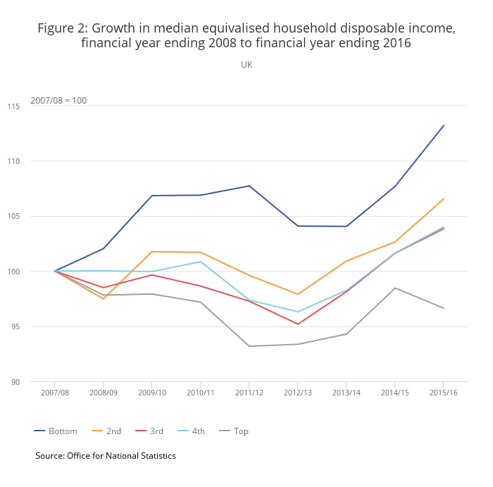
4 UK median household disposable income 2103/4 £26300, 2015 £27600, suitable source Note that (i) gross pay will be dramatically higher, add back income tax, nat Ins, council tax (ii) that this is per household, not per person. The ONS source separates the retired (but they mean collecting state pension); it also separates the different quintiles of the distribution (e.g the bottom quintile’s median came up and the top came down, each of which is deemed to be good). See Fig 2 above.
There is an interesting gap between GDP per person and the higher disposable income; one measure of well-being is the gap between GDP per head and net national disposable income [NNDI] per head. The mean is well hidden, probably because it is a much larger number and the ONI doesn’t want politicians shouting it around. Half the population is of course below the median, but an awful lot more are below the mean and since the press thinks anyone below the average is a cause for campaigning (merely emphasising how much they do not understand about numbers), we don’t want a majority thinking they’re badly done by.
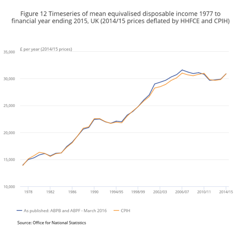
The 2015 figure (Fig 12, right) is just under £31,000; mean equivalised disposable income).
