
This page is currently a collection point for stuff I'd like to explore further. So for example the content now in Essay 314 and 315 started here.
_______________________________________________________________________
A question often asked on Quora is about 'average running' times. Here's what Runner's World has to say:
Sure, you've been training to run a faster 5K at your Saturday morning parkrun, but are you faster than the average runner? To find out more, we took a look at recent data collated by RunRepeat, who analysed 107.9 million race results, from over 70 thousand events in 209 countries between 1986 and 2018 and asked them to share the UK specific data with Runner's World.
The average 5K finish time in the UK is 00:33:54. For male runners, the average finish time is 00:29:08 and for female runners, the average finish time is 00:38:12. What is the average 10K finish time in the UK?
Over the 10K distance, the average finish time for all UK runners is 00:58:08. For male runners in the UK, the average 10K finish time is 00:53:38 and for female runners in the UK, the average 10K finish time is 01:03:18.
Over the past ten years, race participation got more popular, with a 164% growth in the UK alone. Yet unsurprisingly, as the fields got larger, the average pace got slower. In the 5K distance, the average pace got 00:02:57 slower, and in the 10K distance, the average pace got 00:02:51 slower.
As I have written before, this is the average time for the (very) restricted population of those that run, those that have offered themselves to be measured against the clock. [Timed run, not a race; the difference is subtle but important.] It is not at all easy to estimate how many runners there might be, but there were around 10,000 (not)parkrunners in the UK last week and there were 5 million registered parkrunners worldwide in 2018. Source. (Not) park run because we're not to do it, so people post their best time from the week, measured by themselves. 11,000 people got their parkrun barcode since March 2020. There are almost 53,000 males registered with runbritain, 64,000 in total. These are, generally, what one would describe as club runners. I looked at our last published parkrun result from March 2020 and 150/250 were unregistered. A very small sample, but that might suggest the 64,000 registered runbritain numbers would increase to beyond 100,000 runners in total. In a population of 67 million, that is paltry. In the last parkrun I did myself, only 37/250 were affiliated, suggesting that the running population for the nation might be nearer half a million. The number of women registered is very small, but the number at parkrun is large, much nearer half. [Of the 250 in parkrun 155 at Blackpool, 130 were male, 110 female, 30 were not known or unregistered, total 270 and numbers counted fast by me, so a little unreliable. But at least 40% were female on a date in February. One might say that the biggest estimate of the running population is around half a million, and it could be twice that. Even so, that is at best around the 1% level in the population, when one might expect a reasonable target to be more like 5-10%.
I found a site exploring how many might run a mile, here. Self-reporting said 60% thought they could (28% said they could not, 12% would be slower than 4mph). draw the line at 5mph and we're down to 43%. And that, of course, assumes that the sample used was valid for the population you're thinkng of extrapolating to. This was Americans, whose nation admits that around 1% can run and is quite possibly data transferable to Britain or even to Europe.
RunRepeat has some interesting data. While not explaining who their population is (that is, to whom it applies), they say 35 mins is 'average' for 5km, 64 mins for 10km, 2:03 for the Half and 4:30 for the marathon. Gender adjustment to make. The old fit git tapers rapidly at distance according to these figures, somewhere in the top 20% for both 5km and 10km – though I'm assuming this is prepared race conditions.
_______________________________________________________________________
I note that the idea of the 15 minute city is spreading slowly. My article was, it would appear, early. The spread of pedestrianised spaces causes binary response, extremely for or extremely against; the viable issue is the lack of consultation, but at heart the decision is between improving the street space for those who live there or for those who wish to traffic that space (at some speed). This reduces to acceptance or denial of the use of the car, or, if you like, right of access to tarmac, 'right to road'. If we were to accept that all rat-runs were to be closed and that therefore all routes—up to the point at which you turn into 20 mph zone because you're within the odd hundred metres of target—were on more 'major' roads, designated as thoroughfares perhaps, then we'd also be accepting of traffic loads. These loads would be permitted because the aim is to persuade you to not use the car, to restrict the car to 'permitted' spaces only, so as to (dramatically) change the way we view that form of transport. This has possibilities, but in turn demands that there be sufficient parking space. And perhaps it implies prodigious provision of (cheap, even free) public transport. In a C-19 world public transit is failed (scary, unused, crowded, unsafe, empty; conflicting ideas) and in a pollution-sensitive world we need to do everything we can to encourage localised (15-minute) transport, which could be to walk, to cycle, to use public transport or public-ally available transport. That also presumes a load of other infrastructure that moves stuff (people included) between hubs and it does nothing at all to preserve business and leisure in any version of countryside. For example, I don't see any form of public transport taking me to or from a walking route in the hills. Matters of socialisation and leisure seem to conflict with this ideal.
_______________________________________________________________________
Trump has Covid.
Just desserts, one might hope.
_______________________________________________________________________
Trump has Covid.
Just desserts, one might hope.
_______________________________________________________________________
Money Laundering in Britain
I read about Britain being something of a centre for money-laundering [1] at the time it was published, July 2019 and, stupidly, thought not much more about it. This article explains what it is that has turned Britain into a place quite perfect for rendering any ill-gotten gains 'clean'. Do read it for yourself, but here's a short version.
Back in 2011, the business secretary, Vince Cable, decided to reform, to 'open up', Companies House. As a result of this so-called reform, anyone, anywhere with an internet connection, could set up a UK company on the very cheap – and no-one would check any part of the information. Indeed, one of the very few prosecuted cases was that of one of the very few people who has tried to alert the authorities to the problem. Companies house simply doesn't have the resources to do any checking, but then that is the fault of their funding and remit. Do read it for yourself.
However, given that I've crossed a rubicon of sorts and no longer give trust to any part of the machinery of national government but the ONS, what is described in source [2], which pads out the story a little more. In 2019 I shrugged and moved on, thinking that the authorities would read, react and fix this. Now, my thinking is rather the reverse and I wonder instead quite who is supplying whom with rewards for continuing to turn a blind eye. Quis custodiet ipsos custodes?, as Juvenal put it, but I want something stronger, since I want the government not just held to account, I want the deceits stopped at source – as many as are found.
I find this situation coupled, in my mind, with the position of 'the most expensive MP", Robert Halfon in his repeated campaigns to prevent any increase in fuel duty. Not least the proposal for feebates [4,5]. See bonus malus. I wonder who benefits from his campaigns, and therefore who funds them; I wonder how Halfon himself benefits, since I simply cannot believe he does this only out of conviction. Such is my jaundiced view of the nation state.
[3] https://www.spectator.co.uk/article/the-budget-puts-petrol-in-the-tories-political-tank if you can see it. try here instead https://capx.co/can-the-tories-win-over-the-workers/
[4] https://bettertransport.org.uk/sites/default/files/research-files/Feebates_report.pdf and
[5] https://www.theguardian.com/commentisfree/2020/sep/04/treasury-raise-fuel-duty-chancellors-freeze and
==========================================================
Solar Panel Update
I discovered, today, that the stoppage of the Feed-in Tariff scheme (FIT) back in March 2019 has been replaced with the Smart Export Guarantee (SEG) as of January 2020. If this was announced in Jan 2019, as described, it was done very quietly. I rang my supplier about the whole issue of giving away electricity to the grid for no return and enquired of several other sources, but nothing came back with any positives. I only found others like me frustrated at the situation. I certainly did not find news such as at [7], or I would have reacted immediately.
I wait to see if my application is acceptable and will report back. The legislation demands that suppliers pay something, but does not stipulate a rate. The only good news is that one may 'sell' surplus to someone different from who it is that one buys it. So if I buy from EDF, say, I may apply to sell to E.ON – with good reason, since EDF buys at 3.5p while E.ON does so at 5.5p per KWh. One assumes they are buying the same thing. [8] shows a table. My previous attempt at solar panels yielded 50% of I think 9p per unit via the FIT scheme, right between these figures — and I recovered perhaps as much as £700 in a year, though most of that was realistically subsidy. We will see and I shall report. As yet I am not even certain that our meters record what we export, and though one of the smart-meter gadgets (the IHD, in-home display) does show that we're exporting, it doesn't record running totals. I really cannot be bothered to argue, since my opinion is of no value: it is only the official attitude that counts, so if I do the work that shows me what we've exported, or even succeeded in not buying, that figure will only serve to annoy me. When and if there is a return for supplying the grid has little to do with what I want. I am happy that the system has been returned to something approximating fairness (something is better than nothing); I am unhappy that I've missed the whole summer's gain for no return and I am at the same time happy at the prospect of not having to try so hard to use energy when we are generating. I have been cultivating the habit of running around the house turning stuff on so as to use excess power rather than give it away.
[8] https://www.solar-trade.org.uk/seg/
_______________________________________________________________________
Use of Number
A recent post from the Winton Centre led me to the Sage Journals and Gerd Gigerenzer. In particular, to this article.
For instance, many citizens are unaware that higher survival rates with cancer screening do not imply longer life, or that the statement that mammography screening reduces the risk of dying from breast cancer by 25% in fact means that 1 less woman out of 1,000 will die of the disease.
Does screening for anything imply longer life? Surely it suggests that some conditions will be discovered earlier than otherwise. It may improve knowledge and feed back to provisdion of better-directed service. But prevention of a death cause is not longer life, but perhaps prevention of an earlier death; I think these may be different in precisely used language.
If 4 women in 1000 die from breast cancer (undeclared in the statement above) and screening reduces this to 3 in 1000 then that is an improvement of 25% — for a carefully worded statement. Better to give more numbers, surely,
In a 2007 campaign advertisement, former New York City mayor Rudy Giuliani said, “I had prostate cancer, 5, 6 years ago. My chance of surviving prostate cancer—and thank God, I was cured of it—in the United States? Eighty-two percent. My chance of surviving prostate cancer in England? Only 44 percent under socialized medicine” (Dobbs, 2007). For Giuliani, these health statistics meant that he was lucky to be living in New York and not in York, since his chances of surviving prostate cancer appeared to be twice as high. This was big news. As we will explain, it was also a big mistake.
What, if anything, could be wrong with Guiliani's take on the figures? There is an assumption that the two numbers are comparable. So what is the 82% a percentage of? Is it cases counted by a biased source? Does it correctly count the whole US population (or just the males, perhaps)? Does it perhaps represent only those discovered as having this cancer and being able to afford treatment? The English figure—and it will be England, not the UK—is likely to be a more complete count since more nearly everyone has access to heath care of this nature. But the two numbers are begging for inspection in detail.I proper hunt through how the headline figures were reached finds that screening in the US hunts for a specific antigen, while in the UK identification is from symptoms. So the figures do not compare at all. But, as we have learned with coronavirus, the special condition is 'diagnosed'. Screening has two significant effects: it changes the timing of a diagnosis and it affects the nature of a diagnosis, notably for those with a non-progressive cancer. What you'd quite like is to know about the cancers that require treatment, not the ones that don't.
Imagine a group of prostate cancer patients currently diagnosed at age 67, all of whom die at age 70. Each survived only 3 years, so the 5-year survival of this group is 0%. Now imagine that the same group is diagnosed with prostate cancer by PSA tests earlier, at age 60, but they all still die at age 70. All have now survived 10 years and thus their 5-year survival rate is 100%. Even though the survival rate has changed dramatically, nothing has changed about the time of death: Whether diagnosed at age 67 or at age 60, all patients die at age 70. This simple example demonstrates how survival rates can be increased by setting the time of diagnosis earlier, even if no life is prolonged or saved.
So we have the idea of lead-time bias, where an early test of some sort moves the game so that the test for goodness (5-year survival) is achieved. Is this a good thing or not? Surely that depends on your viewpoint.
Suppose we have a large number of men screened in the US, which will find the non-progressive and progressive cancers; If roughly a third are progressive, then 5 years later we have, on US figures, 820 survivors, made up of 667 non-progressive survivors plus 153 progressive cancers, meaning that 180 of the 333 died and 820, 82%, survived. Meanwhile in the UK 1000 men identified with progressive prostate cancer left 440 alive. But if the UK approach was applied to the US group we'd be claiming 153/333, 46% survival, really not very different as a result, but perhaps quite significantly different in costs, financial and emotional - and the consequences of those. I know which system I would prefer. And the lead time bias is ignored completely. We might sensibly conclude that a 5-year survival rate is a bad measure (me, too).
Per 100,000 men, deaths from prostate cancer are very similar in the US and UK, 26 and 27 respectively. 26 and 28 from other sources.
At this point I hope (already) I was open to this when teaching and that I showed how to make the numbers explainable. One of the issues with teaching is that unless something like a conference opens your eyes to a general problem, you need to discover this for yourself, That, experience tells me, requires a persistent student with good enough communication skills to allow the mathematician teacher to understand what is difficult about the maths presentation. I maintain—and think I did so for many years—that maths is there to help; I do not think that conditional probability does help understand a situation, and though it may well provide the language to present better ways of explaining to non-mathematicians, I don't think that is sufficient, nor sufficiently helpful, as it makes the mathematics part of the problem, not a route to solution.
In October 1995, the U.K. Committee on Safety of Medicines issued a warning that third-generation oral contraceptive pills increased the risk of potentially life-threatening blood clots in the legs or lungs twofold—that is, by 100%. This information was passed on in “Dear Doctor” letters to 190,000 general practitioners, pharmacists, and directors of public health and was presented in an emergency announcement to the media. The news caused great anxiety, and distressed women stopped taking the pill, which led to unwanted pregnancies and abortions (Furedi, 1999).
Hang on, twice what? A 100% of what, exactly? A more helpful use of number says 1 in 7000 women who used the early pill had a thrombosis; the 3rd generation pill increased this to 2 in 7000. Absolute risk still very small. Result (read the paper) a noticeable jump in abortions, which would raise the number of thromboses quite significantly, it turns out.
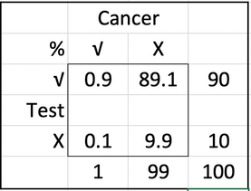
Let's be more constructive: Here's some information: Assume you conduct breast cancer screening using mammography in a certain region. You know the following information about the women in this region:
- The probability that a woman has breast cancer is 1% (prevalence)
- If a woman has breast cancer, the probability that she tests positive is 90% (sensitivity)
- If a woman does not have breast cancer, the probability that she nevertheless tests positive is 9% (false-positive rate)
A woman tests positive. She wants to know from you whether that means that she has breast cancer for sure, or what the chances are. What is the best answer?
A The probability that she has breast cancer is about 81%.
B Out of 10 women with a positive mammogram, about 9 have breast cancer.
C Out of 10 women with a positive mammogram, about 1 has breast cancer.
D The probability that she has breast cancer is about 1%
I'm sorry, but conditional probabilities are fairly sure to give a wide range of answers. In terms of communicating, they are not helpful. To sort it out, suppose you have a large number of relevant women, like 1000; a big sample. You'd expect 10 to have the cancer; of these ten, nine will test positive of the other 990, 9% (that's 89, rounded) will test positive. So if you test 1000, 98 test positive of whom 9 are actually in need of treatment, while one escapes detection. This is not a very good test; but quite clearly answer C is helpful as information. B is downright wrong; the probability that given a positive test, she has the cancer (answers A and D) is 9/98, or 9%.
Perhaps we ought to teach this in Stats classes as a sensible way of approaching what is maths-made-deliberately-difficult, a whole class of exam question. Not only do we have a problem with the presentation of the information to the doctor, if something like 80% of them make the wrong response we have a whole new set of conditions created by the worry attached to a poor (re)presentation of number. What bothers me about this is that it is preventable damage. Here's a table easily constructed from the information provided originally.
Do read the paper. Another link. I'd love to present this to A-level candidates at Plymouth, where a significant proportion were going to become doctors, maybe more than half of all those doing Maths, Biology and Chemistry, which could easily be a third of the whole sixth form.
Summary:
• Don't accept relative risk, demand absolute risk. I've been very frustrated w.r.t. Covid in that regard.
• You want mortality rate, not survival rate. You don't want 5-year survival figures.
• You prefer frequency statements to one-off probabilities. It's fewer words, too.
• Avoid conditional probabilities, use natural frequencies. Count out of 1000 or 100,000 people rather than use percentages.
_____________
I like Speigelhalter.
This is How dangerous is burnt toast?, David Spiegelhalter, 20170123, Winton Centre, Cambridge University.

The Food Standards Agency (FSA) today launched its Go for Gold campaign, encouraging us not to burn our roast or fried vegetables and keep our oven chips at a nice golden colour. The idea is to reduce people’s intake of acrylamide, a chemical that is “created when many foods, particularly starchy foods like potatoes and bread, are cooked for long periods at high temperatures, such as when baking, frying, grilling, toasting and roasting.” (FSA)
Go for Gold
Acrylamide can be, in large doses, a very nasty substance. It is used as an industrial sealant, and workers with very high exposures suffered serious neurotoxicity. Very high doses have been shown to increase the risk of mice getting cancer. The IARC (International Agency for Research on Cancer) considers it a ‘probable human carcinogen’, putting it in the same category as many chemicals, red meat, being a hairdresser and shift-work.
However, there is no good evidence of harm from humans consuming acrylamide in their diet: Cancer Research UK say that “At the moment, there is no strong evidence linking acrylamide and cancer.”
This lack of evidence is not for want of trying. A massive report from the European Food Safety Authority (EFSA) lists 16 studies and 36 publications, but concludes
In the epidemiological studies available to date, AA intake was not associated with an increased risk of most common cancers, including those of the GI or respiratory tract, breast, prostate and bladder. A few studies suggested an increased risk for renal cell, and endometrial (in particular in never-smokers) and ovarian cancer, but the evidence is limited and inconsistent. Moreover, one study suggested a lower survival in non-smoking women with breast cancer with a high pre-diagnostic exposure to AA but more studies are necessary to confirm this result. (p185)
Remember that each study is testing an association with a long list of cancers, so using the standard criteria for statistical significance, we would expect 1 in 20 of these associations to be positive by chance alone.
A standard response might be the over-used cliché: ‘absence of evidence is not evidence of absence’. If there has been a huge effort to find an association, and none has been found, it’s true that this may not be direct evidence of the absence of an effect (though this can never be proved anyway). But it can be considered evidence of an absence of an important effect.
Given the numbers provided by the EFSA and the FSA, it is perhaps unsurprising that no association has been shown in large studies. EFSA estimated the BMDL10 of acrylamide to be 170 µg/kg body weight/day — this means it is unlikely that exposures at this level would cause tumours in mice (technically it is the lower end of a confidence interval for the dose that would cause 10% increased tumours). They then compared this with human acrylamide exposure obtained from multiple detailed dietary surveys. For adults this revealed an average acrylamide exposure of 0.56 and a ‘high’ of 1.1 µg/kg/day, in the sense that 97.5% of people consume less than this. The BMDL10 is then divided by these exposures to give the ‘margin of exposure’, which rather confusingly end up being high for low risks and low for high risks.
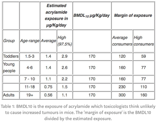
Table 1: BMDL10 is the exposure of acrylamide which toxicologists think unlikely to cause increased tumours in mice. The ‘margin of exposure’ is the BMDL10 divided by the estimated exposure.
So, for example, adults with the highest consumption of acrylamide could consume 160 times as much and still only be at a level that toxicologists think unlikely to cause increased tumours in mice (that’s essentially what the ‘margin of exposure’ means).
This all seems rather reassuring, and may explain why it’s been so difficult to observe any effect of acrylamide in diet. But, for cancer, toxicology committees demand a rather arbitrary margin of exposure of 10,000 before considering the chemical essentially acceptable. That’s 33 times higher than the current margin for average adults in the UK — making acrylamide fall short of this very stringent safety standard, and this is the basis for the FSA’s campaign.
Reactions to Go for Gold may range from the extremes of encouraging obsessive concern in the worried-well, to irate editorials on yet another intrusion from the ‘nanny state’. More worrying, people may just consider this yet another scare story from scientists, and lead them to dismiss truly important warnings about, say, the harms from obesity.
Cancer Research UK say that “ researchers estimate that overweight and obesity are behind around 18,000 cases of cancer each year in the UK”. In stark contrast, the FSA provide no estimate of the current harm caused by acrylamide, nor the benefit from any reduction due to people following their advice. To be honest, I am not convinced it is appropriate to launch a public campaign on this basis.
Newly discovered source: Elemental.Medium.com