
I am losing interest in this whole affair. I will continue to maintain my spreadsheets, but I think I may upload them less often, perhaps reducing what I abstract from the wider collection I have been doing for the last four months—essays 293, 299, 300, 303.
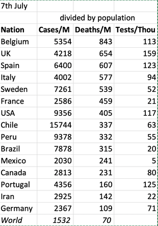
Latest update 8th July Knowing that comparisons are full of error, I present a comparative nation table anyway, to be updated/replaced later in the month. Chile stands out for low testing but high case count (does that mean a lot of guessing?). The US has risen by 1500 cases per million since 28th June, Brazil and Chile by 1700. The UK adjustment of 30000 cases stands out (to me). 4th July comments that Arizona, Georgia, Mississippi Missouri are yet to hit an inflection point (the case count rate is still rising) still applies; add many more, but particularly Nevada and California. CV-19 is widespread in the US and not visibly slowing down. I wonder at their ability to report with any accuracy, given the variability in supply of medical assistance. South African cases are on the rise.
______________________________________________
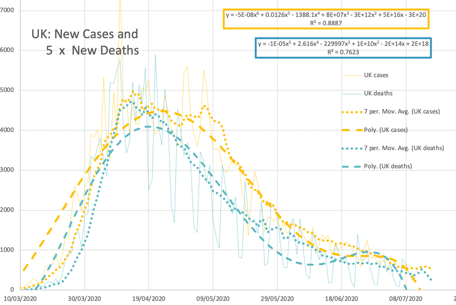
This graph records the UK position, transforming (enlargement vertically, translation to the right) the deaths so that the two curves can be overlaid. Faint line is the data, dotted line is the 7-day rolling average, dashed line is the polynomial trendline with equation and fit as shown. Blue is deaths, yellow is cases.
The reduction of 30,000 cases on 2nd July just serves to further my lack of trust in what is published. This is equiavalent to the French reduction of 40k in June. Result: I'm sorry, but I don't believe you any more; indeed, I wonder what provision of information would serve to convince me that the new reduced figures are honest. A transparency setting increase, please; explain properly, with examples.
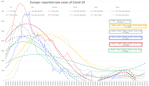
Unless or until there is a second wave, I shall compress the Europe graph, shown for 7th July here and updating perhaps once per week.
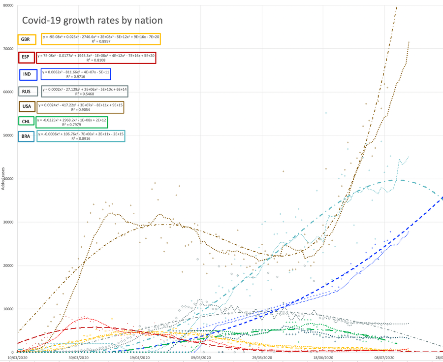
The larger graph shows the top few countries in terms of case count. It seems I want to leave Mexico off. Here the data points are faint, the dotted line is 7-day average and the dashed line is the polynmomial trendline preferred at the time, with a coloured box adjacent. I have decided to suppress the legend entirely.
I copy the BBC report of 29th June, which nicely expresses my disgust with my home nation:
Coronavirus: UK hardest hit by virus among leading G7 nations Economics editor
Analysis also showed that England fared the worst in Europe, just above Spain. The research compared 11-week periods for each nation as the virus hit its peak in each country.
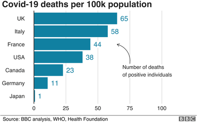
The analysis of Covid-19 deaths and excess deaths - which compared countries in three different ways - showed the UK worse off than the US, Germany, France, Italy, Canada, and Japan.
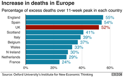
A separate analysis of European nations, by Oxford University economists, has England just above Spain in terms of the proportion of deaths over and above what would be normal.
On all three measures of the G7 nations - recorded Covid-19 deaths per 100,000 people, excess deaths per 100,000 people, and excess deaths as a proportion of the usual level of deaths - the UK has been the hardest hit. Of the G7 nations, Germany, Canada, and Japan, have seen comparatively few deaths.
The UK had registered 65 Covid-19 deaths per 100,000 people, versus 58 for Italy, 44 for France, and 38 for the US.
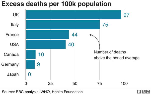
Using "excess deaths" might help account for different measurement techniques, and the per-100,000 people number for the UK is 97, lower for Italy at 75, France just ahead of the US, with Canada, Germany and Japan at very low numbers.
The percentage of excess deaths as a proportion of usual deaths, which help account for age differences in the population, show UK at 52%, Italy at 35%, and France on 24% just ahead of the US.
All the methods show broadly the same picture, although the numbers for the US could change as cases begin to spike again.
Canada's excess deaths exclude three territories that have not yet reported data. However, the numbers have been adjusted to account for that.
A consistent picture emerging
Statisticians argue against making a single league table when every number has its own weakness.
There are many different ways of counting deaths due to the virus and some countries have a better record at diagnosing Covid-19 deaths than others.
Looking at the patterns in the total number of deaths means that these different practices don't skew the comparisons and captures the true toll of the epidemic.
Even with this better set of data, there are different ways to analyse the figures that each lead to a slightly different result.
But if you look across a list of different league tables, each based on its own measure or analysis, the UK consistently features in that list of the hardest hit countries so far.
The separate Oxford study, using the same methods, analyses Europe's worst hit nations using percentage excess deaths as the key metric. It splits out each of the four UK home nations, which sees England just above Spain on 55% and 54% respectively. On this measure Spain has had a worse pandemic first wave than the UK on 52%. England is on 55%, compared with Scotland on 41%, Wales on 33% and Northern Ireland on 30%. The study also identified that England and Wales saw significant excess mortality among the working age population (16-64 years old) over the peak 11 weeks of the pandemic, in excess of 60% in some weeks. This stands in some contrast with, for example, France, where excess mortality in all but three weeks was negative.
The analysis shows that the shape of the pandemic in the UK and England has been quite different to similar countries. The period of marked excess deaths has lasted longer than elsewhere.
Researchers are planning to conduct more sophisticated analyses which compare deaths while adjusting for age. As the UK has a generally younger population, this is unlikely to significantly change the broad picture.
More complicated calculations for the expected number of deaths are also possible, as more detailed data is released.
The government has in recent weeks resisted attempts to compare the UK or English record with other countries, arguing the exercise is premature.
A Department of Health and Social Care spokesperson said on Monday: "Every death is a tragedy and our absolute priority has always been to save lives, guided by the latest scientific and medical advice.
"Although it is important to look to evidence from other countries, comparing figures directly can be misleading as different countries compile their statistics in different ways."
Related pages:
Essay 291 - Effects of an outbreak what it says, effects, but some description of what we have (and not)
Coronavirus (Y10+) modelling problems
Epidemics more general theory
Infectious disease looking at the 2020 problem, particularly effects of the reproduction number changing.
Essay 298 Covid Consequences surprisngly prescient, considering when it was written.
Essay 304 Covid Disparities report on the report, including what it doesn't say.