

We were building castles in the air and wondering if we could afford a similar sized house with a relatively large amount of land. Which served to rediscover how very bad estate agents are at communication, and how they fail to conform to any common standards, not even a unit of measure. But, as an example, we both separately spotted a horse-lover's house with 21 acres. Which sounds like an awful lot, doesn't it? So suppose it was a square plot enclosing 21 acres; estimate the length of a side. Take a guess first, like choose from {200m, 300m, 400m, 500m, 800m}.
Subsidiary question: if you think half an acre of rectangular house plot is 'large' and your frontage is maybe 20 metres wide, how deep is it?
I postulate a 'house index' for housing, which is the building footprint expressed as a percentage of the whole plot. This house is then 30-33%. Of the outside two thirds, just less than half is hard surfaces, so I suggest a second, 'gardenable' index which is the area of soft surface (grass, planted spaces, ponds) divided by the area of hard surface (drive, pathways, garden walling, steps, etc). Here, that is just over 90% but, as a measure, it moves around a lot if measured inconsistently. i think I prefer to express the gardenable area as a % of the non-house area, in which case here would be 52%. Explore
21 x 4840 sq yards / 1.0936² is sq metres. 85000 m². Square root this; 291m on a side. So one might easily have a 1km boundary path.
I acre is 4047m² to the nearest integer, so a half acre could be 20x102, about 100 metres long. Yes, that's a long garden. A half acre on a square plot is 45m on a side and it is quite likely that 20-25% of this is buildings and hard surfaces. Our 500m² is about an eighth of an acre.
A cricket field is about 4 acres. A soccer pitch 1.7 ±0.2 acres (yards, 100x50 to 130x100).
One of my neighbours has no soft surface at all, so zero. My parents' house was around 2. Our house in Wallsend was around 1. The house in Stockport nearer 2.
The Blackpool house is pretty evenly split into three; the buildings footprint, the hardstandings and the cultivatable land. So my house footprint on plot is 33%. Hard surfaces is 170m², soil (and grass) area 182m², house & sheds footprint 164m² total close to 500m². Total built floor area is a different thing altogether, because that's internal floor area, generally something like 120-180% of footprint. Upstairs generally adds less than you'd think. If you look at living space, the numbers come down again, because you lose the communication areas (halls, corridors, stairs); the measure 'habitable rooms' means you ignore washing areas (bathrooms, toilets, kitchens and utility rooms). all of which can result in some oddnesses in design when this becomes a measure (such as one used for taxation purposes), so that communication space becomes part of a room so that it is still declared to be habitable space. Conversely, you might (rarely) find a corridor-type space with some habitable purposes, such as a bookcase on the stairs, or a grand hall, technically corridor, but in practice large enough to be used a s a reception space. Reading. Longer reading. That last link has good content, though I thought the units and measures needed clear definition that I didn't find. Examples: if your back garden is say 15 metres, that is a length not an area, so that corner plots are somehow excluded; a bedroom has 'usable floor area' defined how? Subtracting the bed, the storage and the door swing would make many bedrooms 'usable floor' really tiny; my rented room at university had a residual floor area much less than a square metre by such a measure. Pp41-43.
__________________
The linked article generally agrees with the reports on teaching, that a dramatic number of people say they want to change. Change what, quite, varies. I wonder what the churn level was before we had the pandemic. Leaving a job often requires some combination of finding a new job and overcoming the inertia of staying with the old one. But I think we are at an inflection point at which many people are reconsidering the particulars of their lives and of work-life balance." I point out that an inflection point is where the second differential changes sign, so this is a far weaker statement than I guess the editor recognises. It's inflexion in British English, actually, though we're not terribly fussy.
There is a good argument that says we've discovered the extent to which working from home can be made to work and on the way we had quite a bit of opportunity to discover what is good about home and good about the office, so we could quite easily choose to keep what is good about both aspects of location. There's another argument that says this is all too hard (which I read as 'this doesn't suit me personally and I don't want to put the effort in, so screw you and I'll exert the power I have to reject what all you people want').
As for actually quitting, that is very different from talking about it. The inertia that causes people to stay put is huge, not least because of the allied effort, stress and costs involved in actually bothering to move. Which of course is magnified if 'move' encompasses changing house and employer. To an extent, this can be reflected on the ability of some jobs to succeed under what I might call Zoom conditions, leading to the prospect of (US) 'zoom towns' where the rural life can be embraced fully, while relying on the internet for the city-type office employment, fully remote in a more rural area, permanently.
Personally I think that many jobs can support an element of home working. No doubt on this spectrum there are some which are at one or the other end of a spectrum, where one end is work that simply cannot be done from home such as street-based outside jobs, and at the other end jobs which are already done from home, which would include quite a few of the self-employed. But even those jobs often have elements that are elsewhere.
I continue to maintain that the objection to home working centres around the level of trust between employer and employee. As I noted this week, 'that which cannot be measured cannot be managed'; which reads really well until you find it listed among the great lies of business. Which in turn, I think, merely confirms that it is the measure itself that is at fault and all too often leads to a gaming of the system.
The US labor market (sic, as they'd write it) referred to in the link says the 'quit rate' is around 2.4% per month, while those (only) talking about leaving ranges from 26% to 40%.
A survey of NEU members (a teachers' union in the UK) found 80% of 8000 had considered leaving the profession in 2018. Which, you will realise, was before the pandemic and so perhaps even more significant.
In [UK] education, there was a rise in pupils greater than the proportional rise in teachers. The measure used for teacher retention is by the year and across five years; a typical figure is around 68% for a five-year period. Labouring this, that says that 32% of newly qualified teachers leave the profession within five years. Or, to put that another way, we need to train 50% more than we think we need just to provide sufficient supply. In a little more detail, from the 2018 figures:-
There were 44,600 FTE qualified new entrants in state funded schools in 2018, just over half were newly-qualified teachers, and 16,400 were returning to the sector. However, there were also 42,100 that left. That’s mostly 35,600 qualified teachers who are out of service (which the DfE hopes “may come back as returners in a later year and those leaving the profession”). A total of 6,300 qualified teachers retired, and 130 teachers died during the year. But the overall leaver rate last year was 9.8 per cent – lower than the 10.2 per cent in 2017. original report. There are 453,400 FTE (full-time equivalent) state-funded teachers, plus 263,900 teaching assistants. So the wastage rate, the proportion leaving in any year, is an astonishing 10%. Just among those trained, we have 100,000 who have never taught. Source. That 68% five-year retention rate is not evenly distributed; it is down at 50% for physics and maths, which suggests that there are other subjects with a much better retention rate. Personally, I'd describe both maths and physics as on the lesser-stress list of subjects to teach.
__________________
On other fronts, and perhaps to move to the previous pages on the general topic, this from The Conversation:-
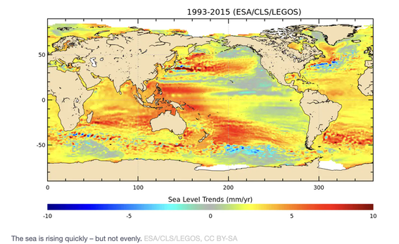
The red/yellow chart shows change in sea level is not at all uniform.
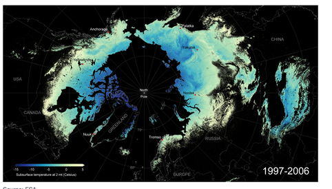
The mostly blue map showing the Arctic Ocean (or would you rather call it a sea?) shows the subsurface temperature at 2 metres and so is a measure of the permafrost, and a place where CO₂ is stored, twice as much as in the whole of the atmosphere. If you look at the link, this chart flips between 97-06 and 07-18, so you can see the recent change, or what the authors think most shows what it is they want you to take away as understood.
Other charts not copied here show the deforestation in Brazil, the NO₂ in Europe changing in 2020 lockdown (comparing Easter 2019 with the same time in 2020).
I looked at all of this and decided that none of this says the world is ending. It of course supports any opinion that says we're getting it wrong, but, as we've learned so thoroughly with the pandemic, the detail figures for one aspect or location don't tell the overall picture, and vice versa.
__________________
The Martians have landed. On earth, already. FullFact felt it necessary to counter-argue a Facebook post which claims that Covid vaccines give recipients “magnetic” properties, and allows them to be detected by electronic devices via Bluetooth. FactCheck 28/5/2021.
__________________
There's a world-wide shortage of chips. There is also a very small number of chip manufacturers. Amongst the mess that is reportage I noticed that some idiot got away with using semiconductor as a substitute for chip, when semiconductors are used in volume to make chips. Calling them microprocessors would be accurate enough. Because one person did, many sheeple followed so I caught this on the radio yesterday (day out, so radio on in car eventually). There might well be a shortage of semiconductor as a base from which to make chips. The referenced article is very poor echo-chamber material. The Guardian is better and as ever references its own related articles, so one can explore the topic as they understand it. Reasons are not well presented, but it appears to be based on (i) the pandemic limiting production for a while and (ii) increased demand, notably from car manufacture. Or, perhaps, that demand has increased and the big manufacturers are hit by this, putting anticipated models into delay. Cars in general; Nissan, Ford. Tech in general, Samsung, Apple.
What this is not is a shortage of silicon, only silicon chips. Which asks why the adjective at all, since we don't base chips on anything other than silicon, much, yet. The food version means different things in the UK and US (the UK-chips are french fries in the US and US-chips are crisps in the UK). Nor is this a particular shortage of other material from which computer chips are made.
Chip manufacture is itself an interesting thing to investigate. Wikipedia. There are two major manufacturers of computer processors, Intel® and AMD®. source. The greatest production is from TSMC in Taiwan (of course; TSMC is the Taiwan Semiconductor Manufacturing Company) and GlobalFoundries in the US (mostly, but also Germany and Singapore). Analysis of a sort. I have to wonder what is missing from the media stories. For example, The European Union (EU) has set a goal for Europe to produce at least 20 percent of the world’s semiconductors by value by 2030. Semiconductor revenue in Europe is lower than in other regions, although Europe does have key strengths which could help it to achieve the ambitious targets. An example is in the production of chips for the automotive industry, with firms such as NXP Semiconductors (Netherlands) and Infineon (Germany) specialising in this field. source. So wouldn't a world-wide shortage encourage a shift within Europe to local suppliers for the car chips? One understands that results wouldn't be immediate. There is understandable confusion between who designs chips and who actually makes them. Also, chips can be for phones and cars and computers and we easily confuse ourselves that these are the same, or different, when making general statements.
I conclude that this is a badly reported tale. For example, Apple used Intel chips (Intel do both design and manufacture) and their newest computers use the M1 chip, which is made by TSMC. A concern in the west is the Chinese attitude to Taiwan, which puts the (perception of) stability of supply in doubt, so, for example, Intel announced an expansion and large volume chip designers such as Apple and Qualcomm (who fairly obviously contract out the manufacture) need to be concerned similarly.
______________
A consequence of this bad reporting is that one may yet be persuaded to pay (support) better independent reporting. However, what pertains here as echo-chamber based on very little real or researched content demonstrates both the need and the current failure for this to occur. As an example, The Conversation sells itself as such a source—"academic rigour, journalistic flair"—but what I read often falls down on one or both counts, perhaps demonstrating that rigour and flair make poor bedfellows. So I wrote to them about this conflict, to no reply a week later.
__________________
A week into June and I don't feel like writing or reading much. But then the sun is out at last and no-so-much is wrong with the world. So I moved a chunk of what I wrote in May onto this page.
Page added to the Maths section about Xⁿ starting with n.
_________________
This old fool managed to fall over while running. One might hope this will teach me to lift my feet (knees) more, but that is unlikely to last. As an indirect result there will be more writing on here.
One long article worthy of share is from The Atlantic, and explains—or purports to—how the US had fractured into four more-or-less separate states of thinking. I have paraphrased throughout what follows. The author, George Packer, has labelled these; first, Free America, which amounts to 'don't tread on me' and seems to me somehow white, redneck, deliberately not responsible and perhaps mostly Republican. Second, Smart America, who are the very vocal and effective top ten percent (not all of them, but mostly from that sector); think of them as meritocrats. Meritocracy also doesn't do responsibility well; smart Americans work hard all of the time, pursuing their version of success and in general not mixing well with those not like themselves. That may give them, accidentally, common ground with the Free Americans (your problems are your own); generally I see Smart Americans as probably democrats. One difference is that Smart Americans seems not to have much use for patriotism, but that also means that by ceding this entirely they gift it to others. Third we have Real America, to whom Sarah Palin and later Donald Trump appealed; these are white, religious, nationalist, working class, hard-working producers, oddly conservative to the extent of indifference to what occurs outside the borders. I read this as white Christian nationalism even if its members denied such. Trump appalled these folk (which explanation I don't understand; I'd have thought he'd appeal greatly). Fourth of these groupings is Just America: they may mean Unjust America, for it is the lack of equality in justice that characterises them. Mostly this is the failure of social justice, but these are people who feel oppressed on some way. Oppression in this sense is that 'the system is out to get them'. These folk see the system as a fixed hierarchy (that rings true in the UK too); they are anti-supremacist, probably anti-white in turn, but every group that identifies as oppressed belongs (an easy list to write). Yet my understanding of the Just America includes many overeducated, underemployed young whites, who continually misreads or ignores the Black and Latino working classes, though I may be conflating ideas incorrectly.
I found all four categories somewhat hollow, though no doubt the certainty that any stereotypical member of any of the four is very definite that they are Right and that their lives make sense in that their actions are consistent with their beliefs. Each group identifies with a problem that is real enough; each offers a value that the others need and lacks ones that the others have. Free America celebrates the energy of the unencumbered individual. Smart America respects intelligence and welcomes change. Real America commits itself to a place and has a sense of limits. Just America demands a confrontation with what the others want to avoid.
Not a description of a country I want to visit; though much of the geography appeals, the people strike me as downright dangerous.
__________________
Floundering around looking for something quite different I found a report that says GOV.UK content should be published in HTML and not PDF. Presumably if so, then perhaps many more documents well outside government should follow the same suggestion. A pdf file is that it is difficult to mess about with, so it is also more difficult to maintain; but that is the whole point, in effect it works to counter all sorts of behaviour the originator views as theft or other abuse. The benefits of using html is that it will fit whatever screen is in use, it is much easier to find and to track – and so, the argument goes, to use, but then that 'use' is what the pdf-user was to some extent trying to prevent, particularly the copy/paste action. Maybe the position is different for HMG, where copying from a site as a quote ought to cause a reader to go view the gov.uk site for the 'latest update', no matter how much what it says is not what the user wants to read. While bits of gov.uk are good (improving, say) at showing date of last update or edit, that does at least recognise that the sort of access most of us want is for the information to be convenient and accessible. Whether those same features apply outside government is a decision for others. Maybe much of the complaint over html would be cured by a sufficient log of edits, which doesn't have to be left publicly available.
__________________
Sunday June 27th to Tuesday 29th a little town called Lytton, in British Columbia, Canada, [article] had daily temperatures just under 50ºC. Lytton is at 50º latitude, so similar to the south coast of Britain. Nearby, and similarly struck, were Seattle and the whole of Oregon and Washington states. Of course, the way our media works, we hear much more of the US plight than the Canadian. Apparently what happens is that the mountains, once they've lost their snow, warm up very quickly, soon dry out and high pressure locally will create a cooking effect at the nearby coast. So not only is the west coast having one of its worst droughts, the temperatures are reaching a range at which even well humans have difficulties. Despite this, do you really think this will cause a change in attitude to climate change?
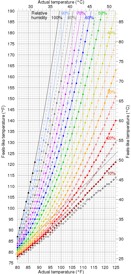
The upper limit of human tolerance for heat is around 35ºC (https://advances.sciencemag.org/content/6/19/eaaw1838). Of course, we can relate this to body temperature, 36.8±0.5ºC and say more simply that we're bad at losing heat. We put out heat as a consequence of generating energy; we have poor processes for losing heat already and if the temperature difference to our surroundings is negative, those processes really work badly. Since a wet bulb temperature means that this is the temperatire at 100% humidity, sweating would be entirely ineffective above body temperature and for many of us our limit is quite a bit lower than that. Wet bulb temperatures above 35ºC occur quite often in south Asia, southwest North America, the lower Indus valley and the Middle East, but not for long. As a metric, the length of these periods is growing and points to climate change that affects us directly as societies. Whether this will be enough to cause change to occur, I continue to doubt. Another measure available is sea surface temperature, SST, and this often passes 30ºC around the Persian Gulf. One wonders whether extreme heat would cause El Niño to falter, and perhaps also the Gulf Stream. Do look at the linked article.
I looked at human tolerance levels for heat (Wikipedia strikes yet again) and wet-bulb 32ºC, by which time few of us can do anything at all outdoors, is equivalent to 55ºC as heat index, so when the wet-bulb temperature is in the thirties, other thermometers are showing dramatically higher figures. For example, 32ºC and 70% relative humidity would suggest a dry-bulb temperature of 41ºC. That's the solid purple line in this graph from elsewhere in wikipedia. The link gives you just the graph, in a partially interactive form. Notice please, that an actual temperature of 27ºC can feel like (left hand edge) 25-31º, that 30º could feel like 27-43º, and that 32º like 29-55º; the increase in the upper bound with increasing humidity is quite extraordinary. that is looking at vertical ranges on this graph. At the risk of repetition, the wet bulb temperature is the black line, the most leftward. If we look instead at the horizontal ranges for a 'feels like' figure, then perhaps is is the 35º line that concerns us, as where our bodies fail; that's a range from 28º at 100% humidity to 39º at 10% humidity (Arabian desert perhaps?), while at 32º, the point at which we mostly cannot function, that I read as 27º in the jungle to 36º in the desert. ¹
If relative humidity is an unknown to you, air-conditioned buildings are expected to function between 30-60%. In the UK, the annual figures range between 70% in June, 89% in December with an annual average (mean) of just under 80%. So a hot day in London (June) at 30º feels like 35º and 32º like 40º; dangerous levels indeed. The wet bulb temperatures would be lower than 'actual', dry bulb thermometer measurements, so these must be read and used with care.
1 The Mojave as I write (sunny at noon) is at 32ºC and 18% humidity so the chart says it would feel like 30º. In Blackpool it is 21:00, 14º and the humidity is 90% right now – it's warm and sticky indoors. In Manaus tonight it will be 21º and 87% but when the day heats up to 32º, humidity will drop to 58%, which is a 'feels like' of 35º; damned uncomfortable. At the south Pole it is -50º, humidity is 62%, it feels like -64ºC and the wind is light, at 13mph (source). All these figures were easily found for 'now'. Yes, I checked that the temperatures were in ºC