
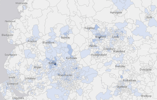
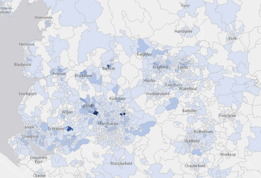
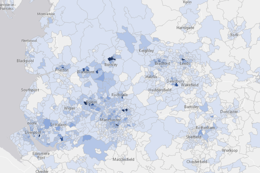
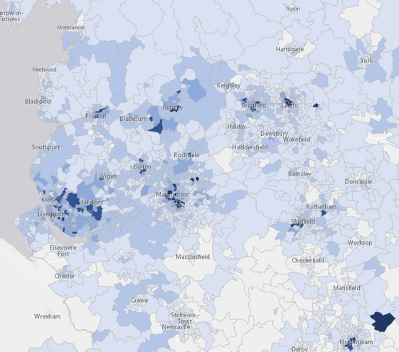
These local cases maps shows the positive cases in a week for areas in the North-West (Morecambe to Worksop, York to Liverpool) in units of about 7200 people, updated daily. Generally the data is 4/5 days behind, so these maps show the incidence of cases for the 7-day periods 29Aug-05Sep, 06-12Sep. 13-19 Sep., 20-26 Sep. The last of these is later still, currently 24-30th
Interest was waning, until the second wave became obvious in the second week of the month, though the hints were already there. Yet again, reaction was too slow by at least a week. What is marginally different is that we have more testing occurring than in April, but the demand is about twice what is available and, if that much were available, the demand would be higher still. We have reverted to 'test only if you have obvious symptoms', where, briefly, we were testing the asymptomatic. We desperately need to keep as much of the economy functional as possible, so full lock-down is not being demanded, more that everyone (and let's reduce the exceptions) behaves sensibly. We still don't have a financial incentive to isolate and that must occur (insert date of Chancellor's published rescue package). While isolation hits your pocket directly and definitely, there is little incentive to share your contact list and less to isolate if you're feeling fine. Much of this (23Sep) synopsis is repeated below as it occurred during the month.
Essays 293, 299, 300, 303, 306 and 311 relate, and remain relevant as references to what was known (and picked up by me) at the time.
A summary for September follows.
I have been hopeful that we in the UK will set up a regime of frequent and widespread testing so as to allow us to be aware where it is we need to raise our precautionary levels. It is pointed out that if a large proportion of us have, say, a negative test within the last seven days, that mass of the population can behave as they would have done in 2019. But to do that we not only need to be able to provide and afford mass repeated testing of the order of millions per week, we also need to be able to afford, as individuals, to isolate without significant loss. At the moment it is clear that (i) the available testing is below demand and (ii) one would not name one's contacts to the track/trace system if one was aware that in doing so you would cause them to lose their income for the next two weeks because (iii) we have no system in place so that people can afford to isolate. If people required to isolate had, say, 80% of their pay up to £30k per year provided by the state whether or not they could work from home for the quarantine period, that might well resolve two of these issues. The government is consistently unable to make a clear statement that does not then change within a short time; the message thus received is that the government is a long way from having a grip on the situation and in turn that implies that they don't have a grip on a range of other matters. In particular, the general direction that the country moves in is what we look to our state organs to provide – and this is what we do not have. The people at the top are collectively seen as weak, especially in comparison to the past and to other immediately available people; the direction in which we choose to go is evidently not in any sense a consensus and one wonders whether the Conservative party would serve the nation far better if it fractured into constituent parts – and then we would all be served far better by proportional representation.
I'm struck by the leap in UK cases, such that the UK has now passed (on the 8th) its own limit for need-to-quarantine of 20 cases per 100,000 in the 7-day cumulative figures. I think of this as a leap of stupidity, so characteristic of the UK of late; England especially. I am embarrassed to be English, not that I have ever particularly subscribed to such a meme, being British and European – and, if pushed, a Geordie or Cornish, but not English. One cannot live on the periphery and easily associate with the centre.
On the night of the 9th we had the announcement of increased general restrictions; the new message, "Hands, Face, Space" and the maximum of six for groups. Meanwhile, the stupidity of suggesting we are prepared to break international treaties is a distraction designed, I think, to draw attention elsewhere. It is a stupidity because we would forever be pariahs; just suggesting it makes us untrustworthy as a nation. Such is the disaster that this government represents. It is likely this is a negotiating ruse, in which case this more mnerly a demonstration of stupidity, cupidity and something darker, such as an intent to destroy. It is a move towards anarchy, I think; how far can we be pushed before we all do a Cummings and say "None of this applies to me"?
R-Number to Doubling Time
Assume R is 1.15. log 2 / log 1.15 is close to 5, so the number of new cases woudl double in five days.
Conversely, if it took a week for caases to double, do log2 /7 and un-log it (10^x on my calculator) = 1.105. If you're doing really well, provide the right precision by repeating the calculation for half a day either way. If doubling is in the interval (6.5, 7.5), then to 3 s.f., R lies in (1.11, 1.10)
As of Friday 18th, the North East is in a modified lockdown, 'rule of six' for all of UK. Imminent lockdowns in other places. Perception is that the gov't has lost the plot, since what the NE thought was appropriate was different from what was set by London. This demonstrates failed devolution which will break down to a battle for power that London wants to win, but shouldn't, else we'll all have even less trust in our institutions. Trust would be engendered by giving power to the locals, even if they get it a bit wrong.
Ten days later, the black spots on the local map are growing like the disease, breaking out all over. Inevitably these are places of high density and disadvantage – which we could equate to desperation in various forms. There are vocal people declaring a Cummings, that this does not apply to them, that they take upon themselves their own risk (because the gov't is obviously incompetent); these are arguments hard to refute in ways that can be believed once one has struck such a pose / attitude. The R number is between 1.2 and 1.5, so we can expect newly declared cases to double every 4/5 days.
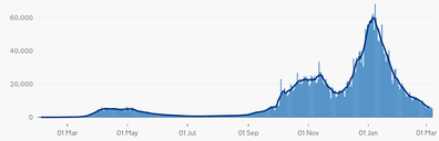
On the right, the blue bar graph is the latest ONS case count for the UK. I've copied here the second chart from that page, case by date reported. 20 cases per 100,000 in any 7-day period works out at around 1.3k on this graph; above that and we break the UK boundary for need-to-quarantine. We passed this on 03Sep. It is the return of school (and hence work) without compensating reductions elsewhere, plus a horde going abroad for holiday, that I blame for this rise. The argument, if there is one, is that the cases 'are among young people' who are relatively very safe from severe illness; that is of no consequence if you're an older person dealing with the young, directly or indirectly so. We must keep the current case count low enough. We learned earlier that prevalence AND reproduction rate are important; both need to be kept low. My feeling at the beginning of the month was that opening schools demanded compensating action. By the 15th one could see that yet again the government was going to react too slowly —which it did, on the 22nd. All that evidence in France and Spain and we repeat the same fundamental mistake. What do we learn from this? Appalling mistrust/distrust of the institutions of state. (That's a miss/diss distinction yet again.)
The multi-coloured charts on the Covid-related pages are created and maintained by me from Worldometers data and corrected as and when I notice there has been a change in the supplied data. Many of these have a logarithmic y-axis, doubling with each shown grid line, so be careful with your interpretation. Some of these have the data divided by population. These two actions serve to spread out the many coloured lines somewhat and perhaps shows change as readily as any other method. I moved the per million version of this to October's page (in December) So, by my figures for September, Sweden was briefly in the quarantine-on-return class (over 200 per 100k), and Portugal reached it at the end of August, while Italy stayed 'safe', just. Not that I see any sense in travelling abroad; while our figures are (so) high, we're in a state where other nations would want British visitors to quarantine on arrival.
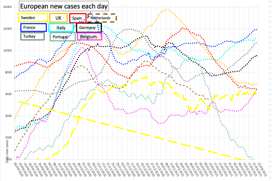
The oscillations (Sweden, most, suggesting I ought to use a longer period for their moving average) are effects of the ways the nations collect data. Just occasionally there is an adjustment backwards as if someone (Spain, Sweden) has attempted to attribute data more sensibly. Sweden especially seems to work a short week. It disturbs me that the general trend of these graphs is upwards, though it is good to see that Belgium is steadily getting something of a grip upon its own issues and the chart shows it took all of October to achieve a turnaround; claims that the UK is worst in Europe are all defeated if you look at Belgium's figures. A correction to UK figures backdated to mid-September prompted a re-input of this pair of graphs, but I have in practice updated them daily. The back-dated result makes us the worst case in Europe again, according to press opinion. Again, with two weeks advance notice we still fail completely.
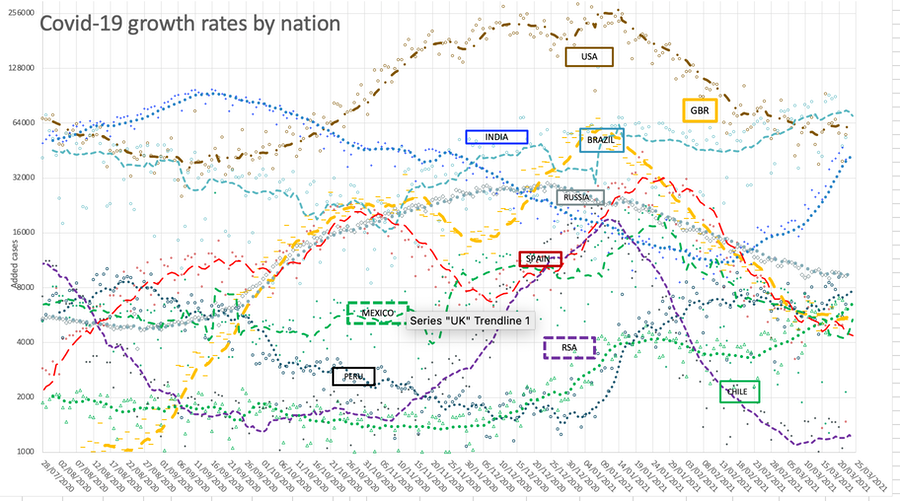
This comparative nation graph shows the continued state of the currently selected major nations. I've kept the top four, and I select from the many items of data I copy each day (for example, I record Pakistan but don't show it). Again, log scale base two for the y-axis. It seems to me as though the situation is remarkably steady from the start of August, with RSA cases declining, those of Spain and India growing across September. As ever, the process of counting is made difficult as that requires a test as evidence, and the provision of testing has a dramatic effect of the level of incidence recognised. If the UK situation is in any sense typical, then the prevalence in the spring was enormously higher than we thought at the time. This was reported and discussed, but the need for information was, I suspect, swamped by more immediate needs.
Here the data points are faint and the dotted line is 7-day average. I suppressed the legend, replacing it with labels in appropriately coloured text boxes. I note what might be a second wave in South America, late November. I moved the lefthand edge forwards in time when Excel had serious problems with the complexity of the graph; one result of this is that India is seen to be in an improving state where through September it had been performing far less well. This graph is updated most days.
This blue and red graph below (blue deaths and red cases) records the UK position, so that the two curves can be overlaid. The faint line is the data, the dotted line is the 7-day rolling average, which sometimes extends beyond the current date. Aligning the troughs produced an offset of 35 days. For a while I duplicated this on November's page.
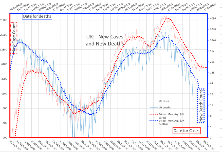
My perception is that the increasing separation of the blue and red lines indicates that we're finding more cases. Also it is suggested that the virus is weakening in effect, which would preserve the virus – and us, too, up to the point where mutations occur. Perhaps this coronavirus will join the legion of others known as the common cold. But the rising trend of active cases is very worrying, implying an imminent surge. This is really bad; there is not much one can do at an individual level about this. The recent correlation is a factor of 200; that is, 0.5% of reported UK new cases closely matches the UK new death figures.
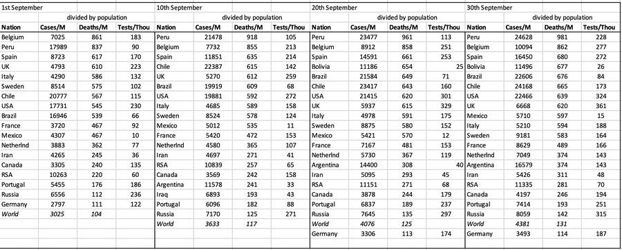
I have added below the invidious nation comparison for several points in the month, only showing per capita figures and ordered by deaths, updated as the date arrives. Worldwide we're looking at 0.01% deaths (pretty trivial in comparison to other causes) and 0.3% cases. Health figures are often given per 100,000 of population, so divide by ten; e.g., a UK aggregate figure of 61 deaths per 100,000 correlates with 610 per million. The worry, for the Northern hemisphere, is that we really do need all the numbers to be much lower before winter hits; the experience is that when we move indoors, illness spreads much more readily. I expect campaigns for vaccination for things like influenza in an effort to reduce the incidence of all illnesses.
DJS 20200903 and then, mostly daily updates
Related pages:
Essay 291 - Effects of an outbreak what it says, effects, but some description of what we have (and not)
Essay 293 - Covid-19 charts charts published daily reflecting concerns and issues.
Essay 295 Long-term Distancing
Coronavirus (Y10+) modelling problems
Epidemics more general theory
Infectious disease looking at the 2020 problem, particularly effects of the reproduction number changing.
Essay 298 Covid Consequences surprisingly prescient, considering when it was written.
Essay 304 Covid Disparities A report on the report, including what it doesn't say.
Essay 316 Covid in September This very page
Viruses are very small Worth reading, I think. (But I would, wouldn't I?)
Essay 318 Covid in October charts updated through November
Essay 328 Vaccine progress What it says on the tin.
Recent notice that children, and therefore the mass numbers in school, show a wide range of symptoms for early stages of coronavirus infection, where vomiting and diarrhoea are sufficiently common to be added to the recognised indicators.
Also, the general understanding now is that the bodily risk definitely increases with age at around 12% a year, so the high current incidence in younger folk (say under 25) is not worrying. 50,000 cases in the school age group night produce one death, 5000 cases for a death at about 30 but more like five cases for a death among the very old. See. Compound interest would suggest that 12% a year means add six years to double the effect; the wife and I are 30 years apart in age so I'm thirty times more at risk, 1.12³⁰ = 30.
In response to a FB post:
Hands, face, space;
Handbag, keys, mace?
Only going down the street,
Need mask and gloves in case I meet
A friend.
Found 20200915, this purports to explain what connects obesity with covid additional risk. That there is a connection is undisputed.
I have attempted an edit to show the relevant content, but do read it for yourself.
The physical pathologies that render people with obesity vulnerable to severe COVID-19 begin with mechanics: Fat in the abdomen pushes up on the diaphragm, causing that large muscle, which lies below the chest cavity, to impinge on the lungs and restrict airflow. This reduced lung volume leads to collapse of airways in the lower lobes of the lungs, where more blood arrives for oxygenation than in the upper lobes.
Other issues compound these mechanical problems. For starters, the blood of people with obesity has an increased tendency to clot—an especially grave risk during an infection that, when severe, independently peppers the small vessels of the lungs with clots. In healthy people, “the endothelial cells that line the blood vessels are normally saying to the surrounding blood: ‘Don’t clot,’” ... because the virus injures endothelial cells, which respond to the insult by activating the coagulation system.
Add obesity to the mix, and the clotting risk shoots up.
Immunity also weakens in people with obesity, in part because fat cells infiltrate the organs where immune cells are produced and stored, such as the spleen, bone marrow, and thymus. The problem is not only fewer immune cells, but less effective ones. [...] They make fewer molecules that help destroy virus-infected cells.
People with obesity vaccinated against flu [have] twice the risk of catching it as vaccinated, healthy weight people. That means trials of vaccines for SARS-CoV-2 need to include people with obesity, because coronavirus vaccines may be less effective in those people.
Beyond an impaired response to infections, people with obesity also suffer from chronic, low-grade inflammation. Fat cells secrete several inflammation-triggering chemical messengers called cytokines, and more come from immune cells called macrophages that sweep in to clean up dead and dying fat cells. Those effects may compound the runaway cytokine activity that characterizes severe COVID-19.
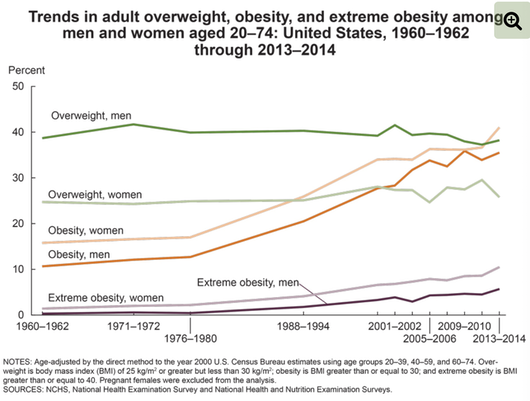
A discussion at home about very large people revealed that there are folk with a BMI over 150. And there's me thinking 30 is bad. Long lists of people over 1000 pounds (440kg). Super-obese is BMI > 50. Some 7.7% of US citizens exceed a BMI of 40. The graph (source) shows this is not improving. There is a strong correlation of obesity with a lack of education (see, Fig 1), poverty and food poverty – disadvantage in general.