
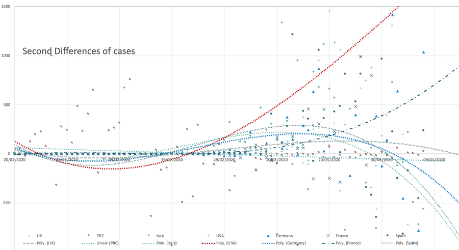
The chart to the right below (Worldometers again) shows cases/population, which as much as anything else demonstrates the counting problems. At the time of writing, China, nearing the end of its outbreak, has stabilised at 57 cases per million, while Italy is over 400 (past 500 on 17th, then 600 and past 1000 on the 23rd, 1700 at the end of the month, double that a month later). I copy the top of the table here. I simply don't believe the figures for some countries lower down the table. I repeat, this issue has a counting problem. If you go to the linked external page, the columns are sortable and doing that to the rightmost column moves many small countries to the top of the list, then Italy, Switzerland, Spain Norway, Austria, Germany, Belgium, Iran; all of these have 250-1000 cases per million of population. On 23rd (data for 22nd), USA has risen to 106 and the UK 84. I've put a second derivative graph lower down this page to illustrate this better. All graphs have been updated daily from the 17th into May.
I edited this page mid-May so as to divide up into separate months. I have reverted the charts to the end of the relevant month. I may not be able to do that to the table above, which looks like May12th.
Here's a complicated chart I made, based on the data published by Wikipedia up to 14th March and then extended using the data found at Worldometers. I've not looked at counting cases, but at the growth of cases, so that the curves are expected to return to the x-axis, as the Chinese one does, creeping along the x-axis. I've added a polynomial trendline for each dataset at the higher index levels Excel allows (5 or 6; index 6 sometimes finds a good reason to turn the 'wrong' way). Trendlines are strongly affected by the delay from the first recorded case in-country to a significant expansion in case numbers.
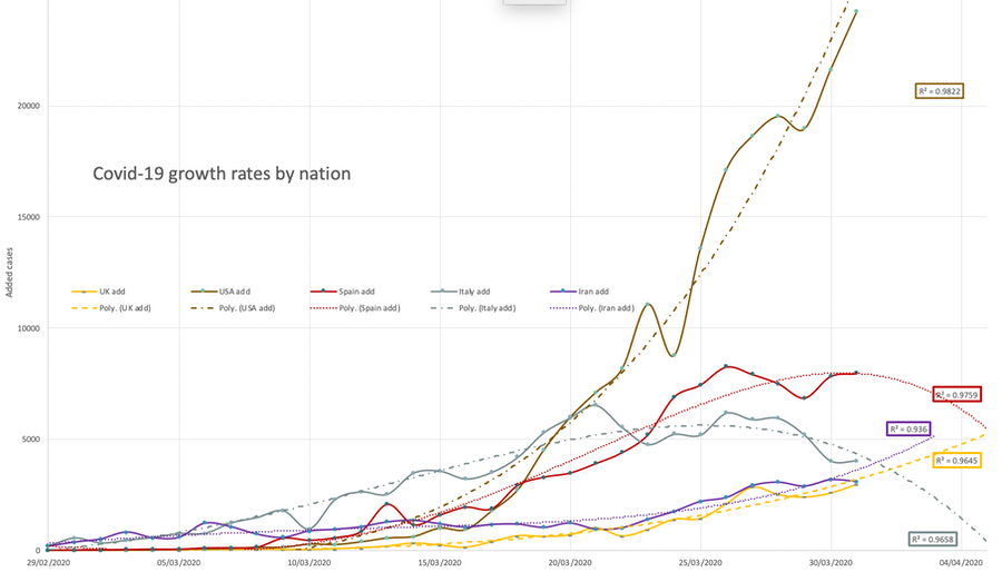
It is interesting to see the effects of intervention. It is interesting how that intervention can be done; the differences in law and culture and things like trust and co-operation are themselves interesting factors affecting the spread of disease. Yet again, what is known is confused by what is only partially understood and contaminated with the downright wrong.
There are significant changes each day and the changes in trendlines are themselves evidence of how risky it is to graph results beyond the data. But we want foreknowledge, so we must do this. I mess with these and choose what I think makes the most sense at the time.
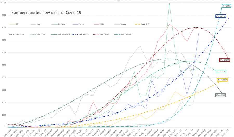
Below I've displayed a selection of countries in Europe plus the USA, but still looking at new cases, not at case counts. This may yet show the effects of different approaches to action. I have not necessarily used the same index on the predictions; Spain may be turning the corner (16th, 17th) but equally there may be a change in the way counting is done. The table at the top provides a better measure in the last column. It is significant that for any state nation, action has a significant delay of perhaps a week before the figures reflect any effect.
Here's a graph, started on 22nd March: this looks at the second differential, the acceleration of the curve. I've added trendlines of index 3. It is possible that this chart is more significant than I at first thought; the vast swoop of the US curve here may illustrate the severity, while at the other extreme on here, the UK curve shows the most flattening (China &Korea have straight lines, not shown). This might perhaps suggest that lockdown has the desired effect.
DJS 20200324
and edited 20200513
Related pages:
Essay 291 - Effects of an outbreak what it says, effects, but some description of what we have (and not)
Coronavirus (Y10+) modelling problems
Epidemics more general theory
Infectious disease looking at the 2020 problem, particularly effects of the reproduction number changing.
Essay 318 Covid in October charts updated through November
Essay 328 Vaccine progress What it says on the tin.
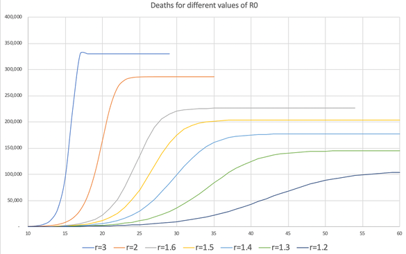
Here's a new graph made from an early model of mine. This reflects whatever numbers I'd set at the time, but if you look at the leftmost blue line, the one with the odd kink in it, and think of that as the toll if the spread is unchecked (close to 100% of possible), you get the general idea, which is all I was trying to display. None of this takes into account the increased deaths from having the medical services stretched past the breaking point; this is the very simplest modelling, the sort of thing I'd attempt (would have attempted) with a Y8 class.
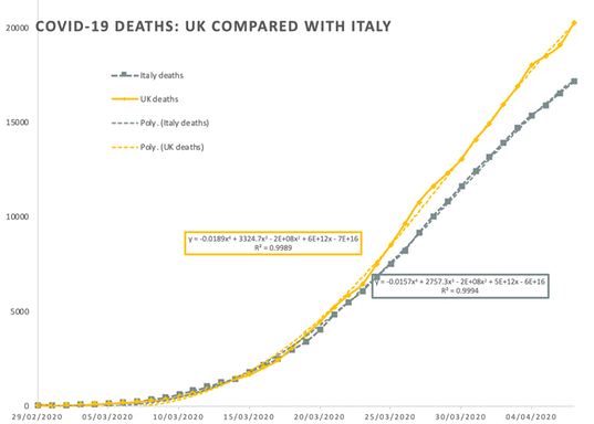
23rd March 2020: Comment on the BBC that the UK is three weeks behind Italy. I checked this out and in terms of cases recorded the gap is closer to 14 days. I changed my spreadsheet to allow me to shift a dataset by several days. The two case-count curves for UK and Italy are very much the same, 14 days different. Looking at deaths, the figures push the UK curve well below that of Italy, at the point well before the Italian health system was swamped with numbers. Note that Italy has more older folk than most countries, so we might expect mortality to be higher, especially once swamping occurs. The UK too has a large proportion of the aged, which is one reason why so much effort is going into trying to 'flatten the curve'. A cubic (23rdMar) fits the Italian death rate very well, second differential a bit over 2.5, while the equivalent UK number is 0.57. Of course, the delay in reaction to any national change—and here too it is the actual reaction, not the change in instructions—causes concern at all levels of governance. Again, it is bad practice to extend beyond the data set (i.e., into the future), but that is what we require with immediate time-sensitive data.
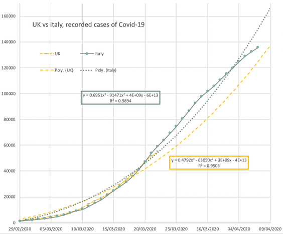
Later edits: Having said all that, the yellow curve has been moving upwards, 25-29 March, as I renew the graph, so something is not working as it was expected to. As I wrote above earlier today, I think we're due some tightening of the screws on Monday. The yellow line has been moving towards the grey one, below, as the last few days have passed.
The graphs here compare recorded cases and deaths, with a shift of 14 days [later, 16 days, the case counts fit far better] to make them overlap somewhat. They are much more similar than they were earlier.
The lockdown required from 23rd March is no doubt influenced by the demonstrable failure in London for people to follow the instructions. Perhaps a reduced tube service caused higher numbers per train, but several video clips of a tube train crowded much as usual (pre-virus) were, I suspect, the trigger to move the goalposts again. As of Monday evening, too, the boss (her indoors) is permitted to work from home; while delighted to be labelled a key worker (she teaches secondary), the rooms on offer at school yesterday were all cold and the little teaching that occurred was affected by this. That said, the boarding staff are having a hard time, helped only partially by so many leaving the premises. I wondered immediately what additional value an independent school offers to this teaching model; I suspect that the difference is not enough to justify the money. If this goes long-term....
Mar 26th India is beginning to report and I expect this to become well out of hand, perhaps to the point where the numbers simply are not available. [But, read this, from 02APR] Italy is in heavy lockdown but the numbers have got out of hand, so there is a sense in which they need to reduce the reproduction number to below 1. I think the Italian care system is already overloaded. Mar25th Infectious disease written, to be further developed.
29th March: It looks to me as though Germany now has a grip and is making progress at peaking. The USA has no grip at all, the UK may want to squeeze harder soon and, relatively, the French should be worried all over again. Spain, on the other hand, has a lower gradient, as if measures are working, at last. Subsequently, end of April, one learns that Spain doesn't include care home figures at all; that accounts for 20% of the UK figures.
The UK reports that of those moved to intensive care, we're losing a whole half. What we do not know is what proportion of all infected that is; it may be lower than 1 in a thousand. If we use 'hospitalised' as a measure of illness, then we want to know how that compares with death and with 'infected'. Soon, we'll want to know numbers for 'immune', however temporary that immunity may prove to be. Worldwide (28th Mar figures) 4.6% of recognised cases have died. New deaths are about 10% of the current critical cases. The variability across nations is high and we will eventually learn something about those care systems — but only if the counting methods are equivalent. Bad data cannot give good results. I think eventually we will only learn reliably what effects the various interventions had within a country, as the ability to compare different nations is compromised by the differences in reporting, even within something relatively homogeneous, like Europe. DJS 20200329
30th March: the 2nd derivative graph implies that all but the UK and USA can see when peak may occur; even Spain's 2nd derivative has peaked (4th derivative now negative), implying that the acceleration will lessen, that things are going to get worse, but not by as much as previous. Small comfort, I think. The US is in for a severe shock. For the first time the press heard 'six months' instead of three months, though the information was given to them weeks ago; they persist in treating the population as complete idiots, even when they think they are explaining what we need to understand. China, who came out from the explosion weeks ago is beginning to relax, but one might note how little they have allowed business to restart (and the press should have been commenting, but has not, or not where I have seen comment). The 'new cases' graph suggests that Germany, Spain, Iran and Italy have peaked, and the US, the UK and France are among those that have not. Yesterday, we began to have sensible (credible) predictions of total deaths per nation. For example, Trump rescinded previous statements (he does that so easily) and, having heard at last that 200 thousand deaths was quite likely, put in place restrictions and suggested that half as many deaths would be good going. In Britain, we're looking at 20 thousand severe cases and maybe half of those dying, but that figure is mine, not matched by published predictions seen by me. It is quite difficult to separate capacity from prediction, which is somewhat silly as they ought to be very obviously different. I ought to spend longer on the modelling. DJS 20200330
Related pages:
Essay 291 - Effects of an outbreak what it says, effects, but some description of what we have (and not)
Essay 293 - Covid-19 charts is this page
Coronavirus (Y10+) modelling problems
Epidemics more general theory
Infectious disease looking at the 2020 problem, particularly effects of the reproduction number changing.
Essay 295 Long-term Distancing
Viruses are very small
Essay 318 Covid in October Charts updated through November
Essay 322 Covid in November UK Regional chart and table through Lockdown Two
Essay 325 Covid in December Updated graphs of rate and prevalence, plus US charts.
Essay 328 Vaccine progress What it says on the tin.
Essay 332 Covid in January Lockdown 3 takes effect