
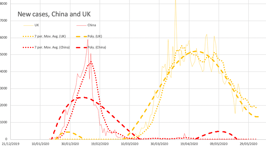
This page follows on directly from essay 299 from when Essay 293 overflowed. This first chart is today's or yesterday's whichever date you look, up to the end of the month. I'll hope for some sort of summary (a summery summary) in June.
1st May link added to David Spiegelhalter's piece of yesterday which agrees with much I've been saying and explains better than I do how we cannot read very much into comparisons between countries. As Chris Whitty has been saying repeatedly of late, we'll be able to do comparisons only when we establish the excess deaths, for which there is a recognised set of rules (what I personally would call an algorithm but would be misunderstood even if correct). I point out here that the excess death calculation says we had 26,400 in 2017/8 attributed to 'flu and 28,300 in 2014/5. Which means that—at the moment—the figures are suggesting something similar. Of course, this position is different in so many ways: we've done a lockdown, which has knock-on effects (those indirect deaths that Whitty explains); we're labelling lots of things we wouldn't normally bother with; this is a disease we don't yet understand, so among other matters we have not much in the way of recognised treatment, which pushes up the incidence and death count. And on top of all of those, we are still not agreeing what we count. For example, Spiegelhalter points out that Spain isn't collecting the care home deaths, that many countries (UK included) are not confirming deaths for the virus (many UK deaths counted as being from covid-19 are probables or possibles and only the hospital deaths are definites). I begin to think that when the dust has settled, we still won't be able to compare countries with any great confidence (which won't stop us doing it, me included) because population age distribution is so significant. Her'e Spiegelhalter's last paragraph: Even – if we can imagine it — [even if] we reach some sort of stable situation, will we ever know the direct and indirect health effects of the epidemic, taking into account reduced road accidents, the benefits of reduced pollution, the effects of recession and so on? Many studies will try to disentangle all these, but my cold, statistical approach is to wait until the end of the year, and the years after that, when we can count the excess deaths. Until then, this grim contest won’t produce any league tables we can rely on.
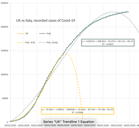
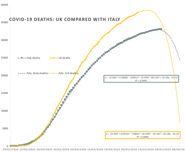
I adjusted the case count comparison graph [It vs UK] by two days so that the two curves overlap more closely, making the gap between UK and Italy 16 days not 14. The case count curves now fit well and the deaths differ more markedly.
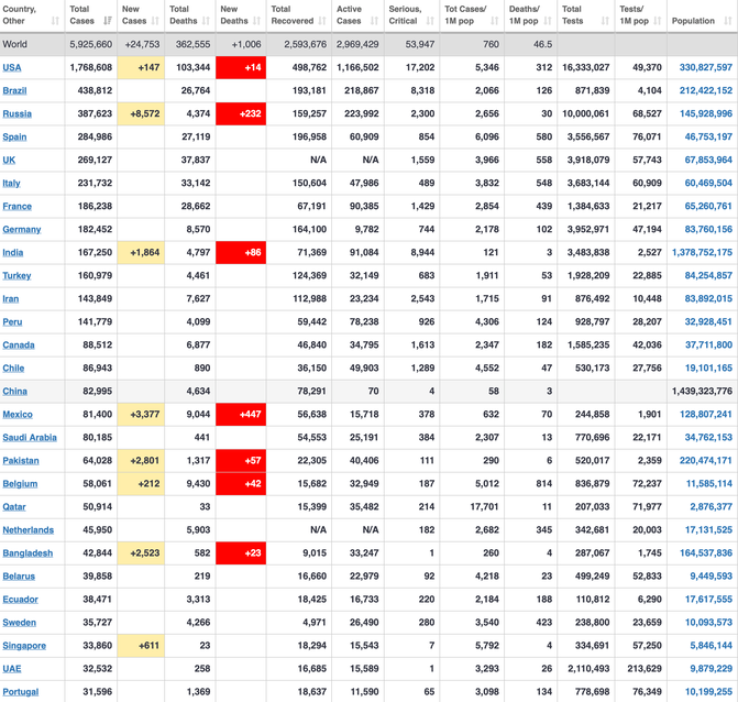
This graph purports to show a comparison between the UK and China, looking at new cases declared. I've added a 7-day moving average, suppressed the data line a bit and added a trend line of index 4-6. All the reds are China, All the yellows are for the UK. This graph will update to the end of the month. I've used the same formatting for other graphs on this page; a dotted 7-day average and a dashed trendline of order 4 to 6.
I detect a change of heart in myself and the media, suggesting a feeling of disappointment at our political handling of this medical situation. I think we will learn that the economic side has been handled remarkably well when we compare with other nations, but I think we will conclude that the spread was already too great at the point of lockdown and that even three days earlier (the Tuesday, not the Friday) for the announcement, plus not holding sports that week (Cheltenham festival, for example) would have reduced the scale of our numbers significantly.
Much discussion of care-home figures shows that the issue is traffic in and out and within any care-home, where any minor slip is exaggerated in effect by the inmates being so very susceptible. This may be subsequently considered a biohazard, but I have noted for weeks that the media describe care homes as being within the care system when they are mostly private institutions. It is a matter of implication, isn't it? So when shouting about PPE for example, the media is fudging whether this is or is not a state-level problem, conflating it with an NHS problem. I see that as a failure on their part for suitable precision in what they share with their readership. The blame game really must stop. What we see in Downing Street briefings is an unwillingness to answer questions as posed; responses are roughly on topic but very rarely provide information not already handed down— and the politicians are the most obvious in doing this. Equally the press demonstrates a similar paucity of thinking; continuing to ask for guarantees, for hard numbers, for predictions that they will they hold as accountable and so rarely asking questions that people can answer helpfully. I also note that each channel will use their own 'today's question' in their next bulletin, often showing the question only (and here I might agree, since the questions aren't answered).
I also wonder whether in time we will describe the effect of lockdown as not so much flattening a curve as slicing off a huge surge of figures; while lockdown is in place (any unchanged state of restriction) we would expect a different curve (same class perhaps, but a distorted one in comparison with the unrestricted state, e.g., R=0.8 rather than R=2.4). Boris Johnson yesterday described us as taking an alpine tunnel rather than going over the mountain and I think this has some merit as a description (though in this case the tunnel is slower than the external route, more as if a flier must walk); by taking the flatter route we avoid a lot of deaths. It is all very well to complain about the deaths we have, but it is important to recognise the level of cases and deaths we would have had without lockdown. That is going to be something that people are going to need to hear about in the months to come. Unrestricted deaths worldwide have been, I think, around the 1% mark, pointing to 650,000 deaths in the UK, not far off the half million (0.8%) I came across during this week as the result of a 'bad' scenario (always called worst-case because the press is poor at precision and loves extremes). So if we have 30-35,000 attributed deaths instead of 10-15 times that, will we look back and say this was appropriate and sensible behaviour? I expect that there will be a lot of 'demanding' that the figure should have been under the 20,000 that the medics said was a 'best-case' and which the press leapt upon as somehow guaranteed, hence their disappointment and attitude change when that number was passed. Look back at 2014 and 2018, top paragraph of today's edit and ask yourself if this is so very much worse. Not only is blame and hence trust a problem, so is the manipulation of expectation.
DJS 20200501
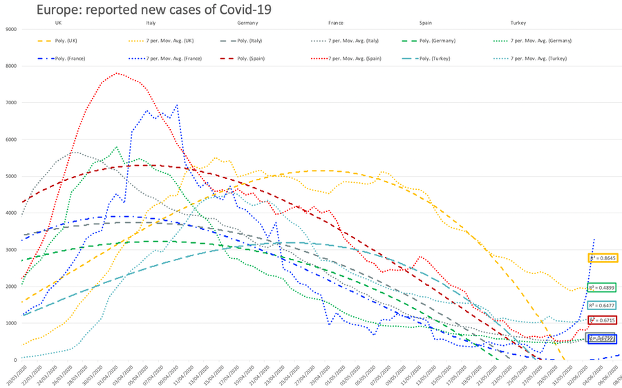
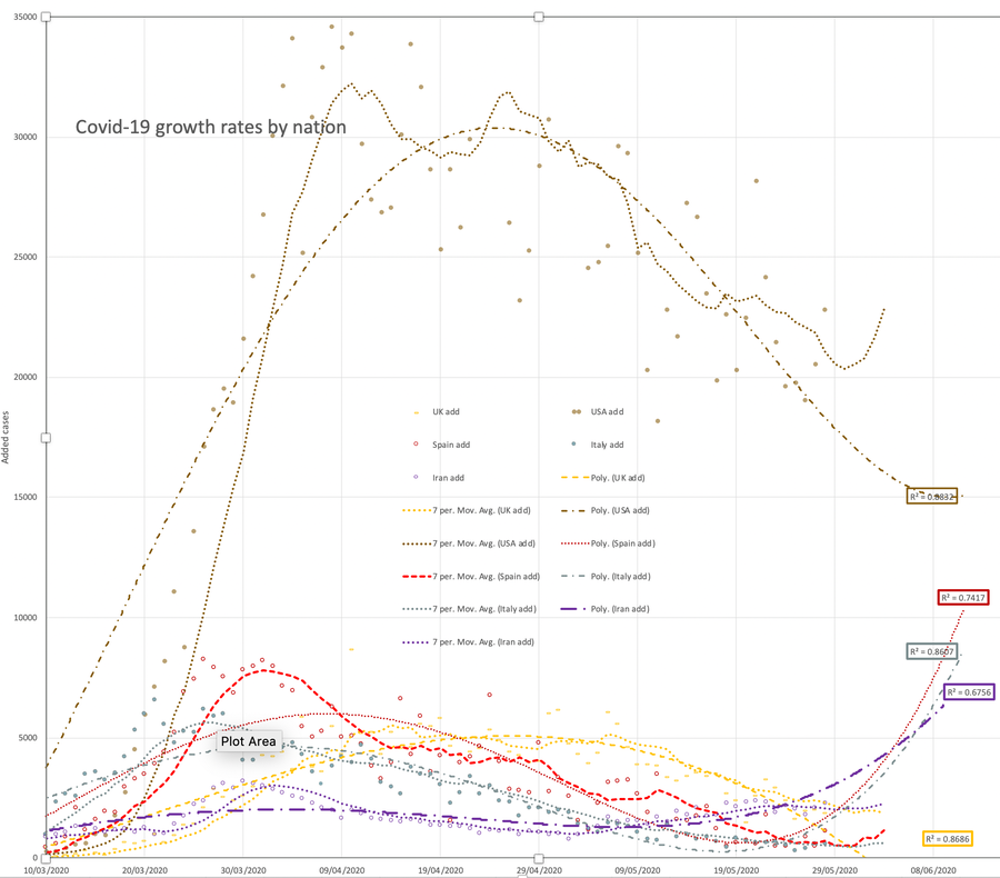
3rd May. Charts changed so that one is Europe only, with Turkey included. Lots of visible noise around the trend lines, so I made the data less obvious. At some point I fumbled and all the lines changed to some restricted colour setting (blues and greys), which took ages to return to something like the variety I had before. Today the habit to put Japan at the bottom of the worldometer copy makes for an unusually long list.
I see the beginnings of a campaign to describe the British control as poor. If this occurs it will cause the eventual comparison between nations (the one that is a year away and supported by suitably rigorous analysis) to be even more ignored, because of inconvenient truths. Oh, perception is all, isn't it? Why do we allow ourselves to be fooled by spin? Why are we so persistent at simply following opinion instead of making up our minds for ourselves? This behaviour argues that 'truth will out' is itself not true. Whether it is not true only now, I leave for others to comment upon.
5th May I read this morning that the US has in parts decided to stop recording numbers; I will attempt to confirm this. We are seeing extensive plateauing of case counts - which is not at all the same as anything to do with peaks being passed. One if Japan's islands is reported as having a second wave. Today's worldometer copy in case count order only takes in the top two dozen, not down to Japan (31st today).
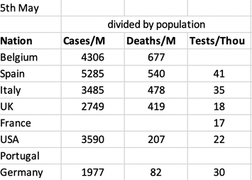
6th May Yesterday evening update showed that the UK death figure exceeds (only just) Italy's. [To the press, this is a significant event, but it might be that they are so starved of content they leap on any snippet of doom. Totally normal, then.] Italy has a slightly smaller population (60:66 million, roughly), it has more elderly (mean age 47:40); it's health system was swamped (which ought to mean more deaths, you'd think, but perhaps not); the two nations record deaths quite differently (see BBC article); testing does affect recorded deaths, since it permits a death to be officially associated, such that Covid or similar appears on the death certificate and is therefore picked up eventually by the statisticians; last, where we have high density, London, is where we had it worst and nowhere in Italy is even a third of that size, but we might compare Lombardy (10 million, worst hit) with London (9 million, worst hit, though counts for London could be 15-30 million, depending how you consider it. The death figures for Italy include a lot of 'don't know'. Since we recognise that in the UK we have perhaps 20% of our deaths located in the very many small care homes, we might take this as a first approximation at the error in Italy too. A first stab at excess deaths (same article) looks at the first 6-week period from the first such death: UK excess 16923, Italy excess 25354. Per capita deaths across Europe still put Belgium way ahead (in a sorry way, nearly 700 per million), then Spain 548, Italy 485, UK 433, France 391, Holland 302, Sweden 283. [USA 218, Germany 83]. In total case count, Brazil and Russia are showing in the table towards the top, now. I'm beginning to think this page should be divided to make a report at the end of each month. Later...
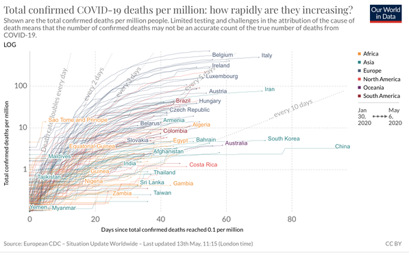
7th May I found sensible evidence of criticism of the UK position by other nations. https://www.theguardian.com/world/2020/may/06/complacent-uk-draws-global-criticism-for-covid-19-response-boris-johnson The included graph with the log scale fails to show differences, in the sense that it shows the European nations included to be in very similar positions. It would be a far better graph if it was to show per capita (per million of population)and on a log scale. I may have to do this myself.
8th May I detect a large degree of antipathy to lockdown. The media reporting is of the huge enthusiasm to end it, while at the same time surveys (and competing press) show that a majority is keen to continue to be cautious. The politicisation of this is awful. I see it as selfish in the extreme, what-I-want trumping what-is-needed. It does nothing at all to improve the regard in which politicians are held and that is bad for us all. I caught one comment from an MP to the effect that the many new MPs were likely to vote for what they thought was right, since they haven't spent years jockeying for high office. Oh, that explains everything then; the ambition of an MP is declared to cause any decision to be available for reconsideration, somehow up for sale. That is a disgusting idea; it persuades one that such office should be appointed in the same way as jury service. We listen to the PM tonight announce his 'roadmap to recovery'. I am only disappointed in our national government. Too slow, insufficient definiteness (definition), poor transparency and in consequence a failure to build trust at a time when trust is exactly what we need. Without that essential, people will make up their own minds — and those that take the short-cuts out of lockdown in effect decide for all of us that it is over. My current feeling is that if the nation is to be that stupid we should let them have their heads and abandon it. I don't think it the slightest bit sensible. I'm expecting that the change will be to allow people to be outside and stationary but preserving distancing. Out more but still local to home.
Reference to prevalence coupled with reproduction; we want both of these at low levels. Prevalence is the number of cases (rising as we do more testing of those recognised as having symptoms), reproduction is 0.7±0.2. That will rise with whatever lessening of restrictions occurs, because too many people are stupid (unable to comply, unwilling to comply and more extreme attitudes, all seen by me as selfish). I'd like my trades-men to be back in business, but I want them working differently so as to keep safe, themselves and those around them. Is that me being selfish, too?
Getting bored... Graph above from https://ourworldindata.org/coronavirus-data, a new discovery.
12th May Sunday evening BoJo addressed the nation with much-trailed 'road-map for exit'. Bungled, we both thought at the time; big on enthusiasm, garbled and gabbled on detail. Muddied detail then copied incorrectly by tv media, who all jumped on 1st June and 1st July and have carefully lost the 'not before' prefix. Boris himself bungled hugely by saying what was going to happen before the detail came out—publication of the detail has been piecemeal. So what he clearly should have done was to indicate which day what would be published or to be transparently vague, explaining why he was being so. Trust is an issue. The result was that many rushed off to work on Monday (not clear if he meant immediate, Wednesday or next week) and very many have taken whatever they wanted to hear as having been said. All as predicted and a clear deomonstratiion of mixed messages. The other three nations are unanimous in saying that the StayHome message is wrongly abandoned in England. It isn't abandoned, but it isn't the headline slogan anymore. Another error. 'Britain needs lerts' is the best shortform of the whole.
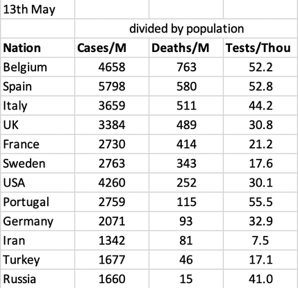
13th May An excess death figure appeared yesterday Source suggesting 35,000 already this year, which rather implies a number nearer 50,000 eventually. That is a disaster politically at national and international level. That will do as much damage, on its own, as Brexit, which is going ahead full bore with no allowances for outbreak. Yesterday too the golden boy Rishi Sunak extended the furlough scheme (Coronavirus JRS) to August and October (both because the rules change in the duration). It is being recognised that some jobs will not reappear, so there are public suggestions of things I mooted a week or to ago (essay 298 for instance) like extended staff training instead of doing very little.
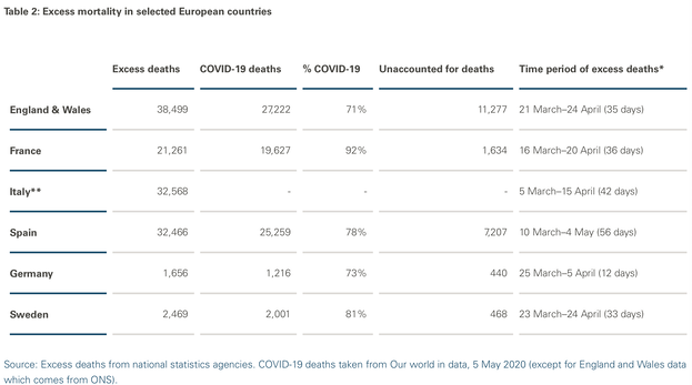
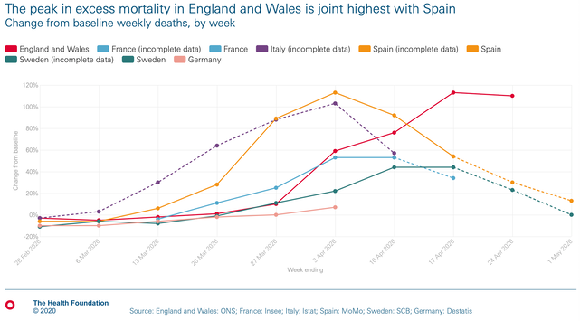
I don't think it much matters whether we account for deaths attributable to Covid-19: since the way in which countries behaved (e.g., lockdown) changed, we might as usefully count all deaths so as to include the indirect benefits and losses. Table 2 from the same source. If we take excess deaths per capita, which strikes me as the only sensible way to compare countries, then it is fair to say we are among the worst performers because fine differences are covered by the differences in counting processes.
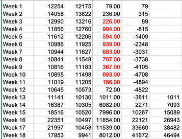
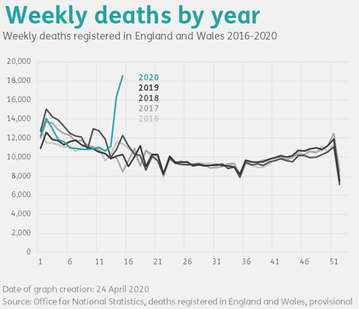
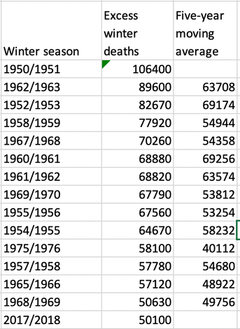
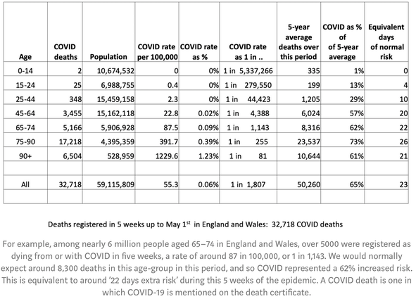
15th May An ONS report for up to 1st May says Between Weeks 1 and 12, 138,916 deaths were registered, which was 4,822 less than the five-year average for these weeks. However, between Weeks 13 and 18, 108,345 deaths were registered, which was 46,494 more than the five-year average. The number of COVID-19 deaths contributed 75.3% of the excess deaths when compared with the five-year average in week 18. My spreadsheet excerpt explains these numbers. Do follow the link, which should also point you to the latest release. Or search for Deaths registered weekly in England and Wales from the ONS website. In case you missed it, England and Wales make 84+3=87% of the UK population, so the UK as a whole has passed 50k excess deaths on this crude measure. I found the graph Weekly Deaths by Year at Full Fact, but not at the ONS. I will attempt to resuscitate the information. You might see an update here. Looking back a little further at excess deaths we had spikes of excess winter deaths exceeding 80,000 three times since 1950. That says quite a bit about improved housing and warmer winters. Spreadsheet insert gives this list; info from ONS, Fig 1.
In 2005, [Prof Neil] Ferguson said that up to 200 million people could be killed from bird flu. He told the Guardian that ‘around 40 million people died in 1918 Spanish flu outbreak… There are six times more people on the planet now so you could scale it up to around 200 million people probably.’ In the end, only 282 people died worldwide from the disease between 2003 and 2009. Spectator
A hard look at the ONS data shows that weeks 12-24 there is no discernible pattern; that death rate is pretty stable for the not-old all year except for this patch. No idea why. DJS 20200515
16th May Felt a need to understand Simpson's Paradox, which applies to granular subpopulations being approximated as one larger population. Wikipedia explains well.
17th May Report today found in the Guardian on care home deaths around the world. Implication that perhaps there are significant numbers not finding their way into the official figures for CV-19 deaths. One of my correspondents persists in typing this as corvid ; ah, 'tis the crow of death (Macbeth, King Lear and Hamlet can contribute suitable material). Also, Brazil's figures are becoming significantly large. Belgium still tops the per million capita death count at 777, followed by Spain on 590, Italy 525 and the UK on 508 per million.
18th May "Are we there, yet?" A growing volume of criticism, as if the general fear is turning, as with road rage, looking for someone to blame. The occasional optimistic piece in the media is to be balanced by depressing exhibitions of political bias. I am amazed how few of the articles I read are well researched and how many have but a single point (of course, also in the headline), such that message is sufficiently covered in the single screenful of what I think of as appetisers. That is no way to feed healthily.
We seem to have established an acceptance that any and all numbers tell any story we want them to, that if we only were to look harder at the numbers the story would be quite different. Which is not at all the same as being opposite, only different. The Simpson's paradox issue, for example. We are seeing more people pointing to diversion so as to direct attention away from a failure (e.g., by the corporate No10), which I happily translate as a willingness by the media to chase any chance to up the fear factor. For example, whether we should open schools. I recognise the perceived need to get the kids out of the house so one (two, both, all) can go back to work and I applaud the unions questioning whether this is safe, and whether safe for staff. There is evidence (not complete, not entirely convincing) that kids catch this lightly, recover quickly, transmit it somehow 'less'; fine, but that also means that the adults around the kids catch it worse (than the kids, certainly). How we run schools at twice the staffing load (1:15 not 1:30) remains unexplained—unless we do, say, 5 days in 10 or 15. Whether we could run schools very differently, so that the disadvantaged were given advantage in return to school, is not discussed. What is evident is that those from disadvantaged backgrounds (I think we mean poor, ill-fed and ill-housed) do less well at school and more 'less well' the more school they miss. Which is to say that the better-off are able to cope far better at home-schooling; but these are the same people whose voices are heard and they will (they expect) always be first in any queue for expected service (unless receipt is somehow demeaning). Could we possibly do means-tested schooling aimed at redressing imbalances? Politically unlikely, methinks.
A second wave of doubt comes from wondering the extent to which 'return to work' (i) is not going to happen for many as their jobs have evaporated (ii) will attempt to return to exactly as before (iii) will be so heavily modified by perception of change that the job itself disappears (iv) that businesses discover (I hope) that a lot of work could continue to be from home. I also wonder if there might be a strong correlation between those for whom home-working is impossible and the same disadvantaged families whose kids fare less well out of school (and, if we are to believe the figures, in school, too). We are made receptive to data by this outbreak event, but that doesn't mean at all that we have good data from which to form opinions. Mind, most of us have been forever happy to form opinions from very little information, but even so we generally try not to make decisions based on bad information. If this virus outbreak has taught us very little, then testing information for sense has been one of them.
CV death rankings per million today: Belgium 781, Spain 591, Italy 528, UK 511, France 431, Sweden 365.
CV testing per thousand today: UAE 162, Lux 99, Den 78, Spa 65, Port 61 Belg 59, Italy 50....UK 38..US 35
CV cases per ten thousand today: Lux 63 Spa 59, Bel 48, USA 46, It 37, UK 36, Swe 30, Fra 28. DJS 20200518
19th May Definitely bored, now, in some sort of limbo in which one feels that 'everyone else' is returning to something we at home don't have. That is a left-out feeling quite as much as one that says we-are-right. Sufficient limbo to not go running yesterday, which is quite as much a comment on my mental state as it is that the weather gave a marginal excuse to act that way. Yes, it is half-term, so of course the other half spent the whole day (as perceived by me) working at school stuff. In her office another eight hours, just like Sunday. Consensus is drifting to the perception that the gov't is staffed by idiots where what I'm reading agrees with me that they had a brilliant chance to build trust—and blew it. Even Tigger (Minister of Health Matt Hancock) came up with some preposterous statement in the Commons yesterday, saying black is white. A pity, I had been leaning towards him up to that point.
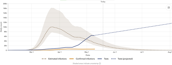
A past pupil posted on FB about survival rates and my attempt at a clarifying response showed that on the worldometer numbers Total Cases less Active Cases = Deaths plus Recoveries, as one would hope, but that the UK figures are N/A, for some unexplained reason, perhaps to do with that the figures we have produced show something altogether wrong, a 25% survival rate compared to more like 80% elsewhere in Europe. I guess this is a facet of the suspicion that we have had many more cases survived and untested. I copy a graph from the IHME nearby that illustrates the huge gap between suspected and confirmed cases. Testing on offer today to anyone over five who wants one, but that is the antigen test. I think we are in need of an antibody test, so that (i) people at risk can remove themselves from a testing regime and (ii) more particularly, those who have not knowingly had symptoms can discover if they have 'had' it. Meanwhile we await publication of the population sample testing. DJS 20200519
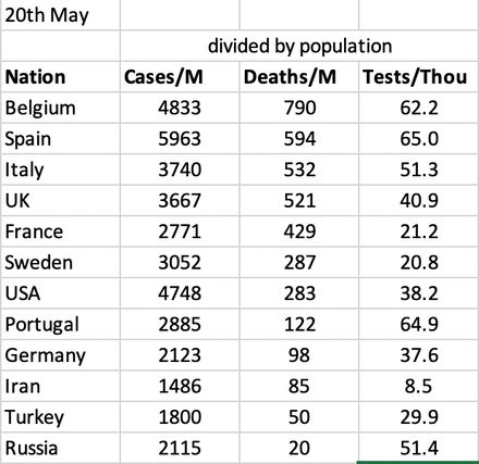
20th May Update of country rankings of disaster. The only changes in order are in the testing, where France & Germany have stayed the same, Spain and Turkey have increased by 1.2%, then Russia, Belgium (0.83), UK (0.82), Portugal, USA, Italy 0.49%, Sweden and Iran by 0.1%. British excess deaths look like they are 65000 and therefore might rise to 75000, which puts 2020 between 1958/9 and 1967/8 on the since-1950 list.
22nd May Something weird with the UK new case figures, which went DOWN yesterday, and so show a leap today (top two graphs, yellow line) - maybe there'll be a later correction.
Article on nudge theory found that turned into a page on its own. On writing that (Essay 302) I found myself re-reading the two essays on the Dark Ages (2017 version) and, considering what we have been going through, it is damn near prescient. DJS 20200522
23rd May Strange effects on the UK yellow line. As testing increases so the number of cases jumps upwards, because these are cases found, newly reported. In a sense, we are moving the threshold of discovery downwards towards those folk who have (relatively) mild experiences. Spain and Germany may be seeing something similar.
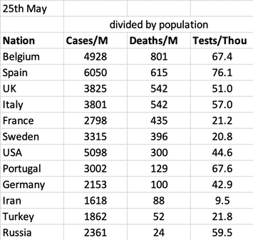
25th May Here's the country rankings on the figures published. There is no change in order in any of the columns since the 20th. I've changed the index of the trendline for deaths (UK v ITA) only because none of the index choices curl downwards slow enough for me to believe. Thus the yellow line curls up and the grey line curls down and I don't see either as a good predictor. UK deaths per million today match those of Italy; of course we still do not know if we're counting the same thing.
26th May I found a reference from Larry Elliott in the Guardian to a study published at the start of May (Milbauer and Aron) that has had a go at the excess deaths figures. They are, of course, not the only ones to attempt this. Page 4 explains how excess death figures are supposed to be calculated (helpful, and I'd use it in an immediate Stats class if I was still teaching). While UK deaths attributed to Covid are the highest in Europe, the excess death data are likely to be more robust for the reasons given. England’s outcomes are the worst of the 24 countries or states for which EuroMOMO reports Z-scores. It is followed by Spain, Belgium, Netherlands, Italy and France. The more I read of this, the more I felt that the abstraction of conclusion was what I disagreed with, that what has been written is not supported by the data and, when it is, that is because the data is of a moment, and so in some sense distorted. If one is going to compare countries it must be per capita (divided by population in some way) and it must be across the whole of the outbreak, not for the odd week of available figures. It is possible to agree that the UK reacted slowly and was less prepared than it had persuaded itself, but that is a political comment, not a statistical one. Similarly, that Germany's outbreak started in young, fit skiers and they reacted quickly. That the UK had dense pockets of population and France has 40% of that density; that the UK has markedly fewer hospital beds available at any moment—but I am uncertain about this, because it seems to me that countries would generally agree on the number of beds required, so I wonder if the care home situation confuses the picture. DJS 20200526
27th May The UK figures have been adjusted for the last few days, included today. Noticed some negatives in the 'additional cases' spreadsheet, which required a slow hunt through the data per nations to find which numbers have been changed. One assumes that declared total case count is adjusted as some cases are assumed to be Covid-19 and then prove otherwise and so are removed from the count. France, 23Apr, 16May, 26May, for example.
29th May I think that cynicism has overtaken the national attitude to the party in power. We will each act as we think fit (appropriate to the circumstances). Those in power have let us down yet again at a time when we needed them to show leadership, forethought and trustability. We have none of these. Each principal has been caught—as far as I can tell—in a blatant untruth. Where reaction indicates disbelief there is no immediate action to supply additional information that supports such contention. The blame game as played by the media will continue and the best I can see as occurring is that each household is caused to make its own decision for what it thinks are the results of sensible reasoning. Unfortunately that means that the 5% or so of total idiots will continue to control what is seen as 'normal', meaning apparently consensus behaviour. I wonder how low that proportion of idiots has to be to not do have an effect perceived as nationwide; surely well below 1%. The other side of this coin is that we don't have protections for when we make decisions for ourselves. Examples that need attention: if caused to self-isolate for a further two weeks, is that covered by sick pay? If you decided that a situation is unsafe enough to remove yourself from it, are you in any way allowed to make such decisions, in the sense that your job is still there?
Taking that just a little further, where is there any evidence that we demonstrate that we have really learned anything from this experience? Are we instead only seeing the result of coping mechanisms, by which I mean the smallest change to routine that accommodates what is perceived as necessary? These are not the same, I think.
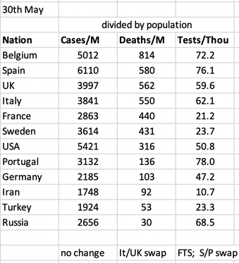
30th May Updated country comparison produced. Changes since 25th may are that on deaths per million, UK now exceeds Italy. On cases, the order is unchanged. On testing, France Italy and Sweden have shuffled and Spain and Portugal have swapped positions Spain's deaths per million have reduced; there is some sort of 'correction' on May 25th of -2000 correction and +85 deaths (74 on May24th). Article from Reuters. The statement from the Spanish authorities says that there was some double counting and some cases had proved to test as not having died from the presumed CV-19.
Related pages:
https://medium.com/wintoncentre/what-are-the-risks-of-covid-and-what-is-meant-by-the-risks-of-covid-c828695aea69 A good read.
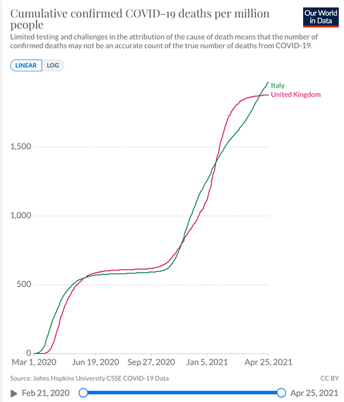
Very much later, Italy's death figures again stand comparison with the UK. This from April 2021. --->
Related pages:
Essay 291 - Effects of an outbreak what it says, effects, but some description of what we have (and not)
Essay 293 Covid-19 (March, longest)
Coronavirus (Y10+) modelling problems
Epidemics more general theory
Infectious disease looking at the 2020 problem, particularly effects of the reproduction number changing.
Essay 295 Long-term Distancing
Viruses are very small
Essay 318 Covid in October charts updated through November
Essay 328 Vaccine progress What it says on the tin.
Essay 332 Covid in January Lockdown 3 takes effect
Essay 337 Covid in February This very page.
Links to explore: