
 I will continue to maintain my spreadsheets, but I think I may reduce what I abstract from the wider collection I have been doing for the last four months—essays 293, 299, 300, 303, 306. I've changed the y-axis on graphs to a log scale in many cases.
A summary for August, written early September. The UK new case count that has climbed steadily as we head back to school has become localised and sporadic. One of the few benefits is that a local area is given warning and so its authorities can persuade people to behave better in the hope of avoiding lockdown. The figures show a widening gap between cases identified and deaths, suggesting that the strain is weakening (the virus will survive better if it doesn't kill the host) and that the virus is spreading in the younger age-groups. At the same time our testing is so very much better we're aware of a bigger proportion of the cases. We still have very poor incentives to self-isolate and to report contacts, as isolation time is not covered by sick pay and the government seems to be uninterested in making that work. Which is doing nothing to engender trust in the system at a time when that is exactly what we need.
We really do need the furlough scheme extended and we need for that (and) or a sick pay equivalent to support people required to isolate; while we don't have that, people will continue to be unhelpful to the track and trace service. On the other hand, we are unaware how it is that we will pay for all of this support; the Tories are promising no major tax hikes, but that won't deal with borrowing equal to a whole year's GDP.
Gov't has screwed up not just the exams (complete rubbish, 25% grade inflation) but is scrapping Public Health England and seems to be unbothered at the loss of services, since the replacement framework, for example, abandons the campaign to reduce obesity. Faith in government is, I suggest, at an all-time low. Yet, despite all of that, the UK looks adequate on one of the comparative charts; not, of course, in comparison to New Zealand. I notice that Sweden has changed its case count again, downwards by 3-3500 back into June. I'll leave them off reporting in September.
14th August Around 5000 deaths have been removed by the UK; 20000 cases removed from the count by Spain, backdating to May/June. And then further adjustment the other way 4 days later. Post-dated changes (downwards) do very little to engender trust, even with some sort of explanation. See Essay 297 - Transparency for related comment. The chart of cases per million explains the return of quarantine for people returning from several European countries as of next weekend, but I think any delay in introducing any new restriction is an error, as it causes mass movement almost guaranteed to include infectious cases. I pointed up Netherlands and France several days ago and any aware holiday-maker (oxymoron?) would have twigged this. But then a sensible person would not have gone abroad at all.
1st August It seems clear to me that we have relaxed lockdown too much, too soon. The telling point was made by Chris Whitty this week when he said we may have reached the limits of what we can do, so that we must trade some things for others. The press has latched on to a choice (theirs, I think) between opening pubs and re-opening schools. That's different from choosing between health and wealth, at least. I think causing the population to stop watching the 17:00 Downing Street briefing ("This is the last of these", 23rd June, now done ad hoc (July 2,3,9,17..)) was a significant error, since we are often told by the media that the communication from government is poor. It is also clear that when you look for detail, the message is sufficiently mixed that one is easily confused. For example, the increases around Manchester in late July were in more affluent areas, not the denser areas with three or four generations per household, not the deprived. The NorthWest is showing increase, but that growth is very uneven. The distinct growth in Barrow of June is now shown to have been zealous accurate testing and counting—in a sense, those Barrow figures were more nearly correct and everyone else was under-reporting, perhaps by 50%. This causes further difficulty when seeking to make any comparisons, from local areas up to nations.
_____________________________
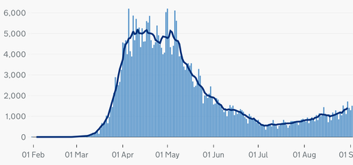
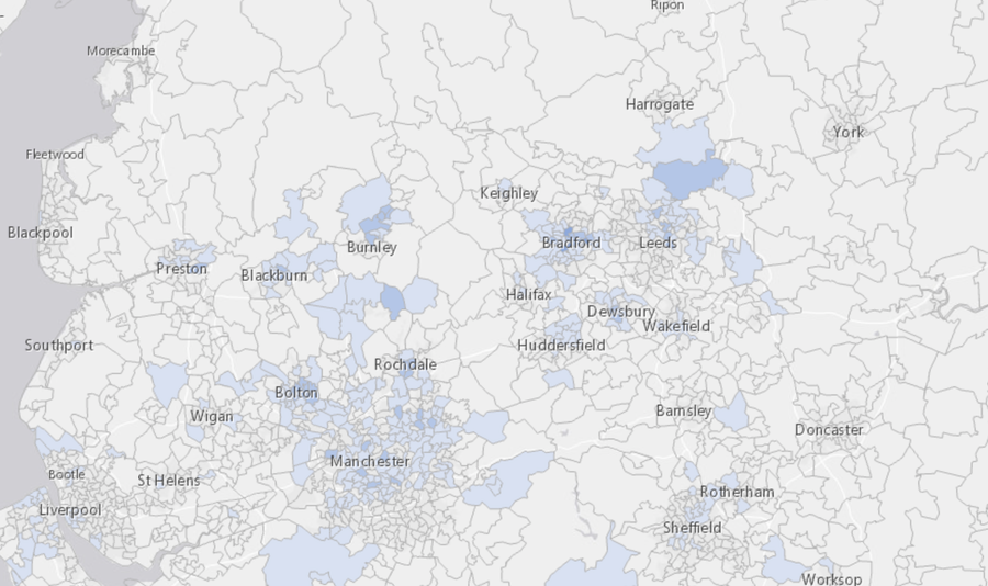
The local cases map is here above. The link takes you to the latest release. This map shows the positive cases in a week for areas of 7200 people (close to a council ward), updated daily, though not copied that often by me. The situation changes rapidly, so don't read too much into what is shown. On the right, the ONS case count for the UK, from the new official site. I'd love to be able to embed this so that you always got the latest version. This link broke 28th Aug as the data was suppressed. Found instead at the BBC here, though the pointer they left as to source failed to yeild the implied information. The ONS latest round-up is to be found here. I'm afraid I read this as deliberate political obfuscation, but wrote to the ONS to point out the break, which was repaired later that day.
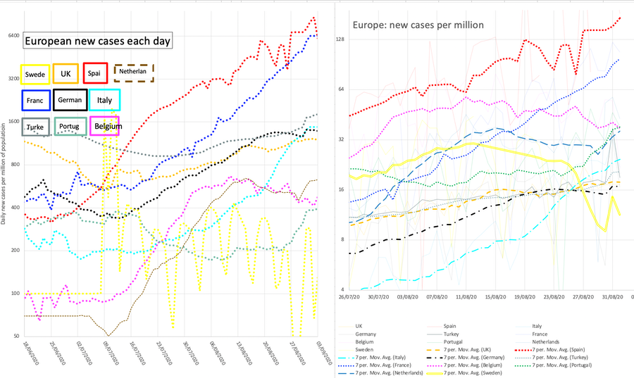
Trying to identify a second wave in Europe, I show 8 selected countries as reported new case count and new case count per (million) capita. Updating of these happens perhaps only once per week. I've tried to keep the colour choices consistent. Yes, I should have made the Netherlands the orange choice. Too many countries use red, white and blue. Poland and Luxembourg missing.
Bear in mind that the choice and precision of testing has an effect on the measurement of prevalence.
Cases per capita clearly indicates who has issues relative to the other included countries. I think we should worry at any discernible positive gradient on the per capita graph, since my perception is that England (more than the rest of the UK) has a real problem and therefore the countries faring worse than us on this graph have an even bigger issue.
In my mind, 1000 new cases per day is five to ten times too many. We seem to be settled at 12 new cases per million. The Italians are faring better at this, but their figures are rising; Netherlands and Germany (obvious positive gradient) are not doing well. For the others, it looks as though there is some acceptable level of incidence. Might that be political or social acceptance? Does the perception of need for income or prosperity (wealth vs health) overcome the perception of danger to (and from) others?
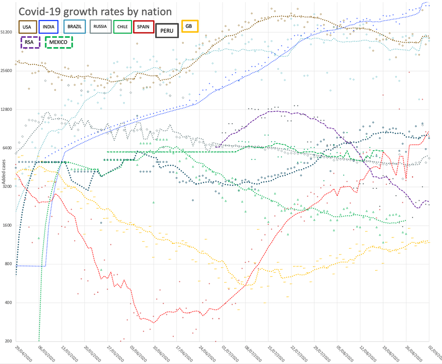
The larger graph 'growth rates by nation' below shows a selection of countries in terms of case count. For no reason but laziness, I have ignored several countries with high case counts. Here the data points are faint and the dotted line is 7-day average. I have decided to suppress the legend, replacing it with labels in appropriately coloured text boxes.
Has the US actually peaked?
This graph records the UK position, transforming (enlargement vertically, translation to the right) the deaths so that the two curves can be overlaid. I changed the factor from the July version [from five to seven and then to eight] to account for fewer deaths per case. Mid-August, I switched to log scale on the y-axis. Faint line is the data, dotted line is the 7-day rolling average Blue is deaths, yellow is cases. I think the only bit of interest now is the extreme right.
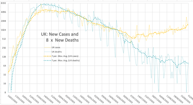
My perception is that the increasing separation of the blue and yellow lines indicates that we're finding more cases (possibly through better, more directed testing) and/or have found better treatments, such that we're losing proportionally fewer people. The media say the reason is that more young people have caught it, mildly. That implies that there is a surge to come when these same younger folk pass it on to oldies. English Deaths are no longer counted as from any cause after a positive test, only for deaths occurring within 28 days of the first positive test, which is how the other UK nations have been counting. That reduced the death count by around 5000.
This business of reacting to a trend is much the same as how people first steer a boat, without anticipation.
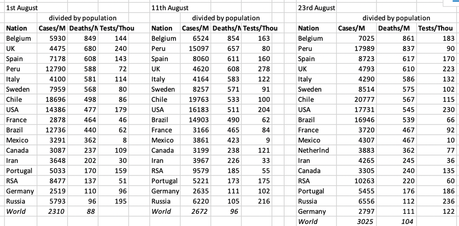
I have added the invidious nation comparison for August, only showing per capita figures and ordered by deaths, Worldwide we're looking at 0.01% deaths (pretty trivial in comparison to other causes) and 0.3% cases. Health figures are often given per 100,000 of population, so divide by ten; e.g., a UK aggregate figure of 61 deaths per 100,000. The worry, for the Northern hemisphere, is that we really do need all the numbers much lower before winter hits; the experience is that when we move indoors, illness spreads much more readily. I expect campaigns for vaccination for things like influenza in an effort to reduce the incidence of all illnesses.
DJS 20200812
Related stuff worth a read:
1. How the pandemic defeated America, Ed Yong, The Atlantic. DJS' subtitle: So you think it was bad in England.
It hasn't been bad elsewhere in the UK, so for once I identify with England.
Normal led to this. America First was America oblivious. Travel bans make intuitive sense, because travel obviously enables the spread of a virus. But in practice, travel bans are woefully inefficient at restricting either travel or viruses. Ironically, they create travel. America’s nursing homes and long-term-care facilities house less than 1 percent of its people, but as of mid-June, they accounted for 40 percent of its coronavirus deaths. More than 50,000 residents and staff have died.
Today, the US spends just 2.5 percent of its gigantic health-care budget on public health. Underfunded health departments were already struggling to deal with opioid addiction, climbing obesity rates, contaminated water, and easily preventable diseases. Last year saw the most measles cases since 1992. In 2018, the U.S. had 115,000 cases of syphilis and 580,000 cases of gonorrhoea—numbers not seen in almost three decades. It has 1.7 million cases of chlamydia, the highest number ever recorded.
The media added to the confusion. During a pandemic, leaders must rally the public, tell the truth, and speak clearly and consistently. Trump is a comorbidity of the COVID‑19 pandemic.
The pandemic has been both tragedy and teacher. Its very etymology offers a clue about what is at stake in the greatest challenges of the future, and what is needed to address them. Pandemic. Pan and demos. All people.
2. Contact Tracing is having a trust Crisis, Sarah Holder, CityLab.
This goes some way to describing why it is people are reluctant to co-operate with track and trace.Not least, that they will be blamed for causing others difficulties. In the US, additional isolation might easily cost you your job, so dire is the employment position. I wonder if we have a reliably different position in Britain and perhaps we don't.
Related pages:
Essay 291 - Effects of an outbreak what it says, effects, but some description of what we have (and not)
Essay 293 - Covid-19 charts charts published daily reflecting concerns and issues.
Essay 295 Long-term Distancing
Coronavirus (Y10+) modelling problems
Epidemics more general theory
Infectious disease looking at the 2020 problem, particularly effects of the reproduction number changing.
Essay 298 Covid Consequences surprisingly prescient, considering when it was written.
Essay 304 Covid Disparities A report on the report, including what it doesn't say.
Essay 311 Covid in August This very page
Viruses are very small Worth reading, I think. (But I would, wouldn't I?)
Essay 318 Covid in October charts updated through November
Essay 328 Vaccine progress What it says on the tin.
Essay 332 Covid in January Lockdown 3 takes effect
Essay 337 Covid in February This very page.
Recent discovery of Medium. One such article discusses effects of Covid on the eyes.