
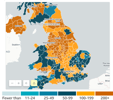
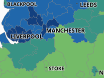
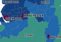
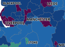
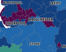
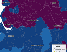
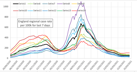
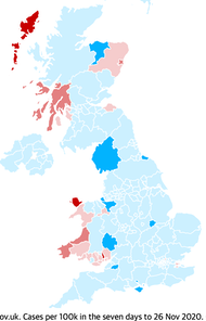
What we are seeing is complexity. Looking at something as large as England shows growth of the respiratory disease of which Covid is one at a level where PHE needs to act. Obvious. At 28Oct, England's new cases this week is around 224 per 100k, which number has only risen across October. Meanwhile Northern Ireland (NI for short) has perhaps peaked at 400. Graphs such as this top mostly orange one from the BBC tell us quite a bit, but the scale needs to show regions above 200+, since some are above 400. So when we look at a different level of detail, such as this map shows, we conclude that, for example, we have an issue across northern England, which I'll call the North. But this snapshot doesn't help understanding as much as we might think. Here's a series of such snapshots at weekly intervals from the interactive map you can play with yourself: 02, 09,16, 23, 30 Oct, so you can appreciate the spread. This blue and green map has advantages, in that it shows where 400/100k is exceeded. The intervals are now set as shown and you can drill down to a smaller region. I look below at Blackburn with Darwen, local to me and hit with high figures quite early on. The gov't provides the data, so you could do this for yourself. I don't see at all how to persuade this to update itself, but I read that this is possible. ¹ UK summary updated daily found here, and will also take you to the map used here.
On the evening of Sat Oct31, Hallowe'en, we had an announcement of imminent tier 4, amounting to lockdown as back in March but with schools open. It will take until Nov05 for gov't to agree and provide fine detail. But my view of the figures says the North East and North West have already peaked, so one interpretation could be 'too late again' or 'who's protecting the South?'. In many ways I think this is necessary, but it should have already happened. Yet we are still unclear what it is that pushes government into action. It seems to me that the deciding factor is the possibility of swamping the NHS and one difference I noted between March's announcement and October's was that there was a specific message that the NHS would remain open for non-Covid reasons (which could amount to as many deaths and as much eventual cost if we did differently).
When asked which countries we should be looking at for useful lessons, a series of sensible people with epidemiological backgrounds pointed to Oceania and Pacific Asia. Four things were observed: early lockdown in whatever form; border controls in place, specifically limiting movement of people; having a test-track-trace-isolate-and-support (TTTIS) system that actually worked; persisting with this policy until prevalence dropped to low numbers, under 100 new cases per week nationally. In Europe little of this has occurred and specifically one can point to (not curtailing) the principle of freedom of movement as a significant difference. Moving later to a form of lockdown moves the numbers of the initial condition higher (Australia perhaps), and if the borders are to an extent closed then the infection is at least confined to the internal population, and in China for example, can be confined to a very much smaller subset of the population. One notes that Wuhan, where there was a point at which everyone was tested, is larger in population than Slovakia, where this is to be attempted in November. Wales moved to a lockdown or circuit breaker state at the end of October, but by the start of November had not yet shown any peak. We are always hampered by the gap from today's available figures and the day to which they refer; we seem to best achieve a 4/5 day delay. Thus the published figures are remarkably behindhand and this is akin to both leading from the rear and driving a very long boat.
The position is made worse by the observation that increases (in case, deaths or hospitalisations) are fast and decreases are slow; to me that argues for early action and very mild fiddling at the edges. Quite clearly this is politically unacceptable, but I feel that a lot of the problem is an assumption that the population as a whole is stupid. For example, the Downing Street Briefing Oct 3, a decision day, included many graphs; they were interesting but unnecessary. We need to know only that the gov't has decided to act. Therefore one wonders why the figures needed to be shown and one such tentative conclusion is that these were offered to present the reasoning for the decision, to persuade people to agree. Which might recognise indirectly the failure of compliance. But, if we already agree that more extreme action has been necessary, then who is to be persuaded? One answer to this is Parliament itself, which I find all too credible. Back in March, and thinking at the time how much we were told that Boris Johnson felt he was in a Churchillian mode, I predicted (to the wife) that we'd possibly have a government of national unity as I think it was called in 1939. A government with ministers taken from wherever provided the most able, a national consensus as to direction and visibly the best minds working on the issues of the day. What we have had instead is almost the reverse, with all that follows.
_______________________
Just because the case count has peaked does not mean that the hospital position is tenable; the length of time that hospital cases occupy a bed means that any growth in hospitalisations is a very bad thing. Thus, while my figures show that there is a peak in growth, in effect that is a change of gradient that is still positive (which is bad) in terms of hospital occupancy, so the critical problem is, yet again, protecting the NHS. We should also recognise that half-term would have an effect reflected in the figures a week or so later, so the brief time (of frantic activity) between half-term and Lockdown Two should also reflect in the figures. Thus I expect to see a dip and then further growth before we see any fall in new case count, maybe in the second half of the month. If that were as much as two weeks, we will then have yet another surge as soon as Lockdown Two is lifted.
It isn't a lockdown, it's a four week circuit breaker.
_______________________
To the right is a chart I made from the large public data file showing regional variation. There's adipping in the figures just before the second lockdown was declared. It then rises because of the notice period to lockdown, which began on Nov 5th (and probably on the 6th). Be aware that the date I show is 5 days later than the data it represents. Latest published detail. So you might expect there to be a drop from the 11th (5 days after the 6th), but there is no such thing. We return to criticising compliance, and/or there is an incubation delay to also add in. The figures will speak for themselves. The graph had to be rescaled around Christmas. 3rd lockdown began Jan 5th. There's a dip in the lines at Christmas, but that's reporting, not incidence.
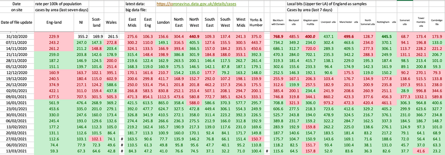
From the 22Nov onwards – that's figures for the 18th onwards and with the exeception of Wales – all regions were heading in the right direction, so that the table below had a largely green line. Lockdown Two began on 05Nov; it clearly took 10-14 days for that to have an effect on the case count figures. The national chart on October's page shows a sudden change on 22nd and 23rd, as if Lockdown Two had an effect that at last showed in the data. The graph above dates that as the 21st. I have no doubt that, unless large swathes of the nation are returned to tiers 2 and 3, that we'll have another surge after Christmas and a third lockdown through February. In Mid-December it was clear that the situation has reverted and that R is above 1 again. The situation in Wales, rates twice that of the other nations, is truly awful.
Here's a table showing some similar detail to the line graph immediately above. It serves to illustrate that not only do we have significant spread at regional level around the all-England figure, but also that within a region there can be dramatic variety. In the table, red is worse, green better. Map of that trend, reds bad, blues good, right and below. The first day I noticed no change for the worse was the 18th. On Nov 20th, reporting up to 15th Nov, we have, for the first time an improvement in the rate figures across the board in the table above, a wholly green line. Of course, that line will vanish as the table lengthens and I show only one line per week.
20201231 figures show an amazing uniform drop, but that is the declaration for Christmas Day.
The modelling studies show that circuit breaker or lockdown does little more than slow the progress of the disease. It puts a sort of halt in the curve; to make a difference it has to run for long enough (10-12 weeks) for the prevalence figures (current case count) to fall. As we have seen since August, returning to versions of the previous normality merely returns us to a previous position on the curve we have followed before—another wave—and, without a raft of other measures that continue to run, we then recommence the progress of the disease from that lower position. A lockdown buys time for other things to be put in place, so it is only a temporary fix. Those things that need to catch up include the TTTIS procedure, but also the financial support systems for those caused to isolate. What is different with the second wave is that the health professionals have learned quite a bit that is useful, we have very much more testing occurring, so the death rate looks a lot lower, we have rather less utter garbage masquerading as information, but we still are not understanding which of the things we could do actually have a proven effect. I suspect we are not identifying processes correctly. For example, 'going for a drink' or being 'out for a meal' could be safe in some places and entirely unsafe in others; moreover this might well have little to do with location and more to do with who exactly is present at the time you are (and infectious). So the labels are not helpful in the same way that many of the restrictions are perceived to be irrelevant. This too is a failure to communicate with clarity.
I found references that said compliance was even lower than before. That is awful, not just as what it says it is, but as a measure of willingness to take anything the gov't says as worthwhile. Under 30% then 11% ... growing concerns about compliance, with only 11% of people abiding fully by the current two-week self-isolation rule, according to research by King’s College London in September.
The rate of change was going in the right direction in the last days of October and the second lockdown is to be enacted (Nov 5th). Yet again we have muddle. We need an explanation (for lockdown) that makes sense without ignoring the way the numbers are moving. I think we need to hear about compliance and we need detail of what it is we have been doing that causes spread. If spread is caused by all those things we do and call socialisation (and substitutes for that) then this needs to be identified, it needs to be explained (pointed at, with lists of 'don't do this'), we need to see compliance from those are supposed to be leading and we need a raft of measures that cause the figures to move to somewhere safe. My read on that is low double figures of incidence (not the five digit figures to which we are now accustomed), coupled with powers to restrict movement very quickly at a local level when this fails, with financial support for those who are required to isolate and penalties for those that breach sensible regulations.
My preference would be for not a circuit breaker but the beginnings of a properly thought through route to something different, else we are committed to 2021 being a repeat of 2020, groundhog style, up to there being a vaccine available. Of course, that assumes that any vaccine serves the purposes and produces the results that people imagine for it; I think this is more dreaming of false realities, merely demonstrating a reluctance to engage with the central issue. And, as we see occurring through December, the imminence (immanence, at this time of year?) of a vaccine has the result that people are rushing back to their old habits (or to perceptions of those), with what I am fully expecting to be a violent third wave to follow. As Jan'21 showed.
I'm thinking (early December) that the political target of having some sort of normal Christmas will result in Lockdown Three through February, on the basis that it will take at least January to see that the numbers are surging again. My previous description of this being like watching a novice steering a long boat remains apt. However, while we do have the late reaction, the corrections applied only deal with part of the problem; the boating equivalent is having additional drag on just one side of the boat. We also need to recognise what happens in places like Oldham and Darwen, who have been in versions of lockdown for many months and who still have a high prevalence. This says that in those places (not all places are the same) there are features of the society (perhaps multi-generational households) that perpetuate infection. I do not think one size fits all; what works in some places clearly does not work in the same way in others. That this is so says to me that we have strong reasons for localised approaches to reduction of infection. At state level, we need for our government to not only recognise this (a problem identified) but to act upon the underlying problems. As the next essay says, this is one of the richest countries in the world and we have issues of poverty and deprivation; that is simply unacceptable.
December will see growing clarity on who quite will be vaccinated when. The reasoning I've seen so far makes loads of sense; for example putting a load of people before me in the queue. In truth I'd rather the boss was vaccinated before me as she is my own greatest source of risk, but there are good top-down arguments to deal with all the more vulnerable before the less so and I think that is a good principle to apply. So the expected order at the moment is the very elderly (care homes especially) and the staff there and in other care situations, then the very many in at-risk categories working down from those most at risk. Schoolkids appear to be off all lists but then I suspect that they'll be dealt with at school in time, what with there being issues of parental permissions. Talk of making vaccination mandatory is valid, but we probably don't want to actually do that, only to talk about it, to imply that we should do so. Of course politicians (and others defined as elite by the Cummings effect) will find all sorts of ways to move themselves to the head of the queue.
In the closing days of November I found I am not alone in my thinking. [2] refers. The WHO tells us six months or longer before Europe hits any sort of normality – I'm afraid that's at least two months shorter than public patience. Sensibly, we need to pace ourselves to June with a possibility of having to last longer still. We are seeing light in the tunnel, perhaps, mostly due to promises of vaccines. I am hoping that the effort put into emergency activity will have consequences for other vaccine development but we'll need 2021 to discover that. But, given the light in the tunnel, we don't want to fall over now and we can't rush this. Well, we can, but what we can't do is decide that it is all over when that is untrue. Yes, we can perhaps see an end, but the question to ask is 'End to what, quite?" It is quite possible that what we will have is a world in which coronavirus is reduced to the same levels as influenza, in that it can kill, there are several forms and we have a vaccines that we must continually work on, which reduces the damage but does not stop the virus completely. Very little chance of that. What I can already see is that the media are implying a return to 'normal', meaning what we had before. This is not true and we need to be rapidly clear what we have learned that changes our long-term behaviour. I do hope that we don't return to all the bad habits (in terms of bio-security) such that it is only when this happens yet again, that we learn whether we have actually learned anything at all. This comment applies at many levels; individual, family, locality, region, nation and globally. We need a sufficiently large number of us to remain interested in consequences to make sure that we have learned something.
DJS 20201130
Here is the table of national comparisons. I'm sticking with ordering by deaths per million as it is the only definite measure and even that has incomplete consensus how to record a 'death with Covid'. Note that this count is based on anyone dying within 28 days of a positive test, from whatever cause. UK figures seen on 1st Dec indicate the UK passing 75000 deaths with Covid on the certificate irrespective of the 28 day rule, when the 28 day count was about 59000. A 27% uplift.
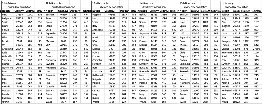
I continue to have issues with the figures from Sweden and Spain and I note that the US historic figures show daily change too, that the data for 'yesterday' is different a day later to 'two days ago'. Other countries make changes relatively rarely. The charts for nations remain on the pages labelled October and September, but I continue to update those. I am uncertain how I will feel about this effort in the new year.
DJS 202011xx
Band committee meeting this week accepted —to my ears—that we are looking at a whole year with no full band rehearsal. We managed some groups of six outside in May; we were looking at the possibility of playing carols in December, but that would be for our own benefit only as there are no viable ways we can make collections. I find myself quite close to binning the idea of band entirely.
1 Import the file as .csv into excel. Identify comma as the delimiter and " as identifying text. Use global find-and-replace to cure what you got wrong, across 55000 lines. Separate out the section of this large file for the area you want to look at - I copied the 200 or so lines for Blackburn to another worksheet within the same workbook to begin experimenting. You now have date, daily lab cases, cumulative and the cumulative rate. That rate is cases divided by population, which number you can work out - I got 139446 for Blackpool, 149696 for Darwen. Not liking the cumulative figures much, because I think it is the rate of change that matters, I then generated cases for the last 7 days and rate per 100k for the last 7 days, which are going to be smaller numbers. What I do not see how to do is collect the new daily information from the website, which process would be called scraping.
Further Reading:
This links to a paper that seems to explain why it is that middle-sized kids have such good immunity to covid-19. NYTimes explainer (the Science paper itself is pretty impenetrable) It’s been a big puzzle of the pandemic: Why are children so much less likely than adults to become infected with the new coronavirus and, if infected, less likely to become ill?
A possible reason may be that many children already have antibodies to other coronaviruses, according to researchers at the Francis Crick Institute in London. About one in five of the colds that plague children are caused by viruses in this family. Antibodies to those viruses may also block SARS-CoV-2, the new coronavirus causing the pandemic.
In a study published Friday in Science, the group, led by George Kassiotis, who heads the Retroviral Immunology Laboratory at the institute, reports that on average only 5 percent of adults had these antibodies, but 43 percent of children did. ..... and the rest of the paper attempts research into how this is.
Interesting development of PPE, discussed, late October, not found until this month. https://theconversation.com/coronavirus-stopped-us-doing-life-changing-surgery-so-we-invented-a-new-form-of-ppe-144752?utm_medium=email&utm_campaign=The%20Conversation%20-%201818917681&utm_content=The%20Conversation%20-%201818917681+CID_6678d02b8d6b378c19cab5b3f6c8a022&utm_source=campaign_monitor_uk&utm_term=a%20new%20form%20of%20PPE
Lifestyle Survey for the last full week of November. Contents table here---->
ONS Coronavirus summary 27th Nov. Good round-up of the numbers, especially. I thought §7 Fig 5 most worthwhile.
Article in The Atlantic returns to the k value, discussed by me previously. Here's some little bits of it:
This highly skewed, imbalanced distribution means that an early run of bad luck with a few super-spreading events, or clusters, can produce dramatically different outcomes even for otherwise similar countries. Scientists looked globally at known early-introduction events, in which an infected person comes into a country, and found that in some places, such imported cases led to no deaths or known infections, while in others, they sparked sizeable outbreaks. Using genomic analysis, researchers in New Zealand looked at more than half the confirmed cases in the country and found a staggering 277 separate introductions in the early months, but also that only 19 percent of introductions led to more than one additional case. A recent review shows that this may even be true in congregate living spaces, such as nursing homes, and that multiple introductions may be necessary before an outbreak takes off. Meanwhile, in Daegu, South Korea, just one woman, dubbed Patient 31, generated more than 5,000 known cases in a megachurch cluster. [....] However, influenza does not have the same level of clustering behavior.
Overdispersion should also inform our contact-tracing efforts. In fact, we may need to turn them upside down. Right now, many states and nations engage in what is called forward or prospective contact tracing. Once an infected person is identified, we try to find out with whom they interacted afterward so that we can warn, test, isolate, and quarantine these potential exposures. But that’s not the only way to trace contacts. And, because of overdispersion, it’s not necessarily where the most bang for the buck lies. Instead, in many cases, we should try to work backwards to see who first infected the subject.
Because of overdispersion, most people will have been infected by someone who also infected other people, because only a small percentage of people infect many at a time, whereas most infect zero or maybe one person.
Meanwhile, researchers have shown that rapid tests that are very accurate for identifying people who do not have the disease, but not as good at identifying infected individuals, can help us contain this pandemic.
In an overdispersed regime, identifying transmission events (someone infected someone else) is more important than identifying infected individuals. Consider an infected person and their 20 forward contacts—people they met since they got infected. Let’s say we test 10 of them with a cheap, rapid test and get our results back in an hour or two. This isn’t a great way to determine exactly who is sick out of that 10, because our test will miss some positives, but that’s fine for our purposes. If everyone is negative, we can act as if nobody is infected, because the test is pretty good at finding negatives. However, the moment we find a few transmissions, we know we may have a super-spreader event, and we can tell all 20 people to assume they are positive and to self-isolate—if there are one or two transmissions, there are likely more, exactly because of the clustering behavior. Depending on age and other factors, we can test those people individually using PCR tests, which can pinpoint who is infected, or ask them all to wait it out.
Related pages:
Essay 291 - Effects of an outbreak what it says, effects, but some description of what we have (and not)
Essay 293 - Covid-19 charts charts published daily reflecting concerns and issues.
Essay 295 Long-term Distancing
Coronavirus (Y10+) modelling problems
Epidemics more general theory
Infectious disease looking at the 2020 problem, particularly effects of the reproduction number changing.
Essay 298 Covid Consequences surprisingly prescient, considering when it was written.
Essay 304 Covid Disparities A report on the report, including what it doesn't say.
Viruses are very small Worth reading, I think. (But I would, wouldn't I?)
Essay 318 Covid in October charts updated through November
Essay 322 Covid in November This very page
Essay 325 Covid in December Updated graphs of rate and prevalence, plus US charts.
Essay 328 Vaccine progress What it says on the tin.
Essay 332 Covid in January Lockdown 3 takes effect
Essay 337 Covid in February This very page.