
Disparity means a lack of equality. The source labelled [1] is the PHE report Disparities in the risk and outcomes of COVID-19, PHE publications, June 2020. I write here because my appreciation of the press interpretation is negative. That is, what I think they are reporting is, in my view, wrong. So, for my own satisfaction and so as to have a place to point besides the 89-page report, I'm going to see if I can reduce the whole.
Here are the disparities: Age, gender, geography, deprivation, ethnicity. But of course these tend to overlap, so that a taxi-driver in the North-West might well live in a crowded area of not-so-good housing and have non-white ethnicity, thus hitting all the buttons and accumulating a lot of risk. Think of there being a survival rate for each attribute and multiplying them together. What is not at all clear is the extent to which we should rank these and I think that is a source of confusion. Age and gender is by far the biggest factor diminishing survival, but how this ranks against obesity (not clearly listed in the disparities, yet perhaps next most significant after age) or ethnicity is unclear. ²
Let's be clear all over again; the figures in the report are based on there having been a positive test for the virus. Thereafter, the concern is with mortality—actually having died, though it is easier from the statistical point of view to look at survival rates.
Age and sex. Having the disease enough to be hospitalised and surviving that experience produces a range of results that strongly connects increased age with the likelihood of non-survival. Generally, men are twice as likely to die as women; specifically Between the ages of 40 to 79, the age specific death rates from COVID-19 among males were around double the rates in females compared with 1.5 times for all cause mortality in previous years. [1,P10]. However, whatever it is that puts a patient into critical care is not the same as what makes for a positive diagnosis. The rate of diagnosed cases increases with age, but the age profile is markedly different among those in critical care. The largest number of patients in critical care come from age groups between 50 and 70 for both males and females and only small numbers aged over 80. The most extreme difference in the whole report is this one, which I expect to see repeated in the press: A survival analysis looked at people with a positive test, and those 80 or older, when compared with those under 40, were seventy times more likely to die.
Of course, there are provisos to take into account. Diagnosis requires there to have been a test that proved positive; among working age people, more women had tests (and more often), but then women tend to work in those occupations with greater exposure. Yet of those tested, males were more likely to have a positive test, which could be a measure of concern, or that the women had a milder disease.
Let's be clear what is being counted here; of those admitted to critical care, 71% are men. [E]ven after adjusting for comorbidities, sex and obesity, the risk of dying among those over 80 was almost 14 times higher than those under 50 years old [1,P11].
Bluntly, men are more at risk than women, by roughly a factor of two. Expressing this in deaths per 100,000 and age-standardised, males 782 and females 439. In terms of a multiplicative probability, p11 suggests p=0.8 if you're female. That's my interpretation.
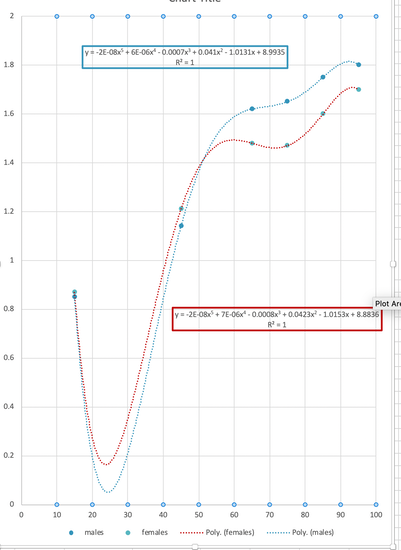
To connect age to morbidity, one need to already understand morbidity with increasing age, a tricky topic. I refer you to figure 1.7 which shows the excess deaths by age category (all limited by the available data at the time); deaths among aged males is twice what we'd usually expect.
I have graphed the increased excess deaths (men blue, women red) in the expectation that this might create a multiplier to apply to death at any age from any cause. R is 1 because I was able to use a quintic on six points.
Geography The regional pattern in diagnoses rates and death rates in confirmed cases among males were similar. London had the highest rates followed by the North West, the North East and the West Midlands. The South West had the lowest. For females the North East and the North West had higher diagnosis rates than London, while London had the highest death rate.
Local authorities with the highest diagnoses and death rates are mostly urban. Death rates in London from COVID-19 were more than three times higher than in the region with the lowest rates, the South West. This level of inequality between regions is much greater than the inequalities in all cause mortality rates in previous years.
Attempting translation of the longer version, it seems reasonable to suggest that population density is a factor, but then that encourages one to muddle this with deprivation and ethnic diversity within a local population. Which wouldn't necessarily be a bad thing. Imagine having an index for identifiable centres: Burnley, Blackpool and Brighton would have significantly different values but even within these towns there would be pockets of dramatically different values.
What this report does looks on the face of things very much as though this is repetition of a lot of information we've had previous exposure to. That is true, but the detail of what it is that we have seen before is attached with some clarity. So, for example, figure 2.1, copied here from page 22, is adjusted for population in the regions so they are comparable, and similalry has adjusted for the difference in age structure. So this graph is of positively tested cases, adjusted. Diagnosis rates were roughly similar for gender. using the age adjusted figures, Diagnosis rates for London were 424 (men) and 318 (women) per 100,000 population; the NorthWest equivalents were 308 and 335.
Deprivation People who live in deprived areas have higher diagnosis rates and death rates than those living in less deprived areas. The mortality rates from COVID-19 in the most deprived areas were more than double the least deprived areas, for both males and females. This is greater than the inequality seen in mortality rates in previous years, indicating greater inequality in death rates from COVID-19.
High diagnosis rates may be due to geographic proximity to infections or a high proportion of workers in occupations that are more likely to be exposed. Poor outcomes from COVID-19 infection in deprived areas remain after adjusting for age, sex, region and ethnicity, but the role of comorbidities requires further investigation.
Deprivation is measured relative to everywhere else in you devolved nation in quintiles of the population, where the most deprived and of working age are twice as likely to die if hospitalised as those from the least deprived (p86, foot, aHR column), though once past 65 the difference is almost ignorable, at 9%. Look here for an explanation about deprivation and here for a report about where I live (really bad, according to these figures). To find out about where you live look at this site. Find your LSOA from your postcode here. For example apparently I live in Blackpool 11b which, ranked out of 317 local authorities with low numbers being more deprived, puts us at the top of several lists. Within the Blackpool area, 11b is something akin to our council voting ward (one of 32844 LSOAs in the country) and we are still in the top decile of all such, though 11c is in the second decile, 12c in the 3rd and 12a&b in the 4th. Hinting that we border on slightly 'nicer' places. Just two such areas in Blackpool council area are in the 5th decile and none are any higher, meaning better. Eight of the worst (most deprived) in the country are here. One of my brothers lives at the other extreme, in the tenth decile.
Ethnicity People from Black ethnic groups were most likely to be diagnosed. Death rates from COVID-19 were highest among people of Black and Asian ethnic groups. This is the opposite of what is seen in previous years, when the mortality rates were lower in Asian and Black ethnic groups than White ethnic groups. Therefore, the disparity in COVID-19 mortality between ethnic groups is the opposite of that seen in previous years.
An analysis of survival among confirmed COVID-19 cases and using more detailed ethnic groups, shows that after accounting for the effect of sex, age, deprivation and region, people of Bangladeshi ethnicity had around twice the risk of death than people of White British ethnicity. People of Chinese, Indian, Pakistani, Other Asian, Caribbean and Other Black ethnicity had between 10 and 50% higher risk of death when compared to White British.
These analyses did not account for the effect of occupation, comorbidities or obesity. These are important factors because they are associated with the risk of acquiring COVID-19, the risk of dying, or both. Other evidence has shown that when comorbidities are included, the difference in risk of death among hospitalised patients is greatly reduced.
Going straight to the tables pp83-88, and standardising on white British (death following a confirmed positive test for covid) of working age as a reference unity (1.00) then Bangladeshi ethnicity has 1.81, mixed white and Asian 0.87. For the over 65s, the figures change, in some cases remarkably; the mixed white and Asian leaps to 1.37, by 0.5, the Asian Brit who is neither Chinese nor Indian ethnically increases by 0.3 (0.92 to 1.22) while the Black British who is neither African nor Caribbean falls by 0.31 (1.5 to 1.19) and the mixed white /Caribbean by 0.39 (1.5 to 1.11). I think this may be a comment on culture, however acquired, and on how one treats the assumed retirement on reaching 65. I don't think saying that the probability is higher (say at retirement) is helpful, while saying that it rises by 20% (from 100% to 120%) is, I think helpful, in that it gives you an idea whether or not you should be considering action. For example, if you are Irish then the data suggests that your survival is slightly better than your typical white Brit, at 0.88 but this rises to 0.96 (which might be 11%) on retiring. The mixed white/Asian jump from 0.87 to 1.5, perhaps a 72% change compared to a white Brit, suggests a more radical rethink of what passing 65 means in terms of lifestyle, but it might have as much to do with the intent not to retire as anything else.
Occupation A total of 10,841 COVID-19 cases were identified in nurses, midwives and nursing associates registered with the Nursing and Midwifery Council. Among those who are registered, this represents 4% of Asian ethnic groups, 3.1% of Other ethnic groups, 1.7% of White ethnic groups and 1.5% of both Black and Mixed ethnic groups. This analysis did not look at the possible reasons behind these differences, which may be driven by factors like geography or nature of individuals’ roles.
ONS reported that men working as security guards, taxi drivers and chauffeurs, bus and coach drivers, chefs, sales and retail assistants, lower skilled workers in construction and processing plants, and men and women working in social care had significantly high rates of death from COVID-19. Our analysis expands on this and shows that nursing auxiliaries and assistants have seen an increase in all-cause deaths since 2014 to 2018. For many occupations, however, the number of deaths is too small to draw meaningful conclusions and further analysis will be required.
Pretty obviously, some jobs bring one into more contact with others likely to be infected and some jobs bring one into contact with very many people, some of whom may well be infected. People are infectious depending how extreme their reaction is, but the use of PPE is generally directed towards situations where one is aware that this is so. Page 50 or thereabouts. Despite the differences in likelihood of exposure, the ONS Coronavirus (COVID-19) Infection Survey for England found no evidence of a difference between the proportions testing positive for patient-facing healthcare or resident-facing social care roles and people not working in these roles (29). These are provisional results and there is a high level of uncertainty about this estimate.
Confusion reigns here. For example, suppose you read that the biggest increase was for Elementary Security Occupations, where deaths were 2.3 times higher in 2020 than in the same period in 2014 to 2018. (page 52). The detail—and it is wonderful to have it—says the 2014-8 average for people in this occupation group was 80 deaths from all causes, while in 2020 there are 209. If you're a taxi-driver the matching numbers are 87 and 217, similar. If you knew how many such people there are (88-114 thousand maybe), you could work out a risk or a relative risk, such as if you were comparing the police with the Army as a prospective career. If there are 87,000 security guards, then it would seem one in a thousand dies (all causes), so that puts the multiplier of 2.6 in context. For taxi-drivers (362,600 licences in 2019), one in 4200 dies from all causes in a typical year and again, that puts the multiplier into context. If the nominal taxi driver is Bangladeshi does that not double his risk (halve the survival probability)? I don't think so but I'm sure everyone else will do so. What it should do is move the survival probability twice as far from one. The taxi-driver has a survival probability of 0.9994 (=1 - 217/362600); if his risk is doubled by virtue of ethnicity, it moves to 0.9988, which is 1- 2(1-0.9994) = 1-2(0.0006). If he also has another condition that presents a further doubling compared to the majority position against which the data is standardised, it subtracts another 0.012, but only if the conditions are independent, which is unlikely. I think a third condition subtracts somewhere between 0.006 and 0.012.
What should work is that any risks that can be separated out as a subset of the population (taxi-drivers, Bangladeshis, BMI>35) should present a route to a combined survival estimate. Lack of assumed independence should suggest a range of values. It simply isn't good enough to say "This is twice the risk" if the original risk is trivial; that is how we got into such a mess with vaccination refusals. It only matters if the risk becomes substantial enough, and to do that we need context so as to decided what it is that 'substantial ' means for us.
This is an occasion where the numbers only have any value if given a context. For example, if every drive has a 'survival risk' of 0.999, how many drives take place before you've reached a 0.8 probability of survival? [only 223]. Adding another 9 digit, to .9999, adds another digit to the result, to 2231]. This gives you an idea what repetition of event might mean and allows you to attribute some meaning to 'survival'. So if the event is 'visit a Covid-19 patient' under given conditions and a risk of .999 (possibly described as 99.9% safe), at around 200 such events your risk of something going wrong (whatever it is that you've called the opposite of survival) has risen to 20%, and at 700 such events, to 50%. Further, if you're a medic with issues such as obesity and ethnicity, the number of events to such a limit reduces dramatically. ¹
Inclusion health groups When compared to previous years, there has been a larger increase in deaths among people born outside the UK and Ireland. The biggest relative increase was for people born in Central and Western Africa, the Caribbean, South East Asia, the Middle East and South and Eastern Africa. This may be one of the drivers behind the differences in mortality rates seen between ethnic groups.
There were 54 men and 13 women diagnosed with COVID-19 with no fixed abode, likely to be rough sleepers. We estimate that this represents 2% and 1.5% of the known population of women and men who experienced rough sleeping in 2019. Data is of poor quality, but this suggests a much higher diagnoses rate when compared to the general population.
People in care homes Data from the Office for National Statistics (ONS) shows that deaths in care homes accounted for 27% of deaths from COVID-19 up to 8 May 2020. The number of deaths in care homes peaked later than those in hospital, in week ending 24 April.
Our analyses show that there have been 2.3 times the number of deaths in care homes than expected between 20 March and 7 May when compared to previous years, which equates to around 20,457 excess deaths. The number of COVID-19 deaths over this period is equivalent to 46.4% of the excess suggesting that there are many excess deaths from other causes or an under-reporting of deaths from COVID-19.
Comorbidities Among deaths with COVID-19 mentioned on the death certificate, a higher percentage mentioned diabetes, hypertensive diseases, chronic kidney disease, chronic obstructive pulmonary disease and dementia than all cause death certificates.
Diabetes was mentioned on 21% of death certificates where COVID-19 was also mentioned. This finding is consistent with other studies that have reported a higher risk of death from COVID-19 among patients with diabetes. This proportion was higher in all
BAME groups when compared to White ethnic groups and was 43% in the Asian group and 45% in the Black group. The same disparities were seen for hypertensive disease.
Several studies, although measuring the different outcomes from COVID-19, report an increased risk of adverse outcomes in obese or morbidly obese people.
DJS 20200603
Small edits 20200628
Essay 318 Covid in October charts updated through November
Essay 328 Vaccine progress What it says on the tin.
By the end of 2020 there are some better presentations of comparative risk. One of the more readable is found at The Guardian, which updates its presentations much as I do, perhaps a little slower and a day or two more behind. move towards the bottom of the linked page.
1 Simplest use of logs. 200 independent events, each of probability 0.999, have a probability of all being successes of (0.999)ⁿ. to find, say the n for which 0.999ⁿ = 0.5, take logs, so that n log 0.999 = log 0.5 => n=692.8. Of course, you could look at this differently, if what bothers you is the time to the first such failure. This is FM Statistics. Many processes are run from a safety perspective by setting a 'sigma-rating', that is, to assume that the process has a normal distribution for errors, to establish what the standard deviation is (that's the sigma, σ). 3σfrom the mean has a one-sided probability (the left over is to the right of that point) of 99.975 (1σ 68.27%; 2σ 95.45%; 3σ 99.73% 4σ 99.9936%. So if you have a daily event (wikipedia) a 2σ event is likely every three weeks, a 3σ about annually and a 4σ twice a lifetime. I'm having some difficulty understanding where the numbers (such as three weeks for 2σ) in the wikipedia table come from; I think either there is a table I've completely forgotten about, or that pⁿ=1/e, which works to 6 s.f.. For example, up to 4.5σ has a probability on the normal curve of 0.999993204653751 and solving thisⁿ=1/e gives 147159, meaning that the failure occurs on average once in 147,000 events, which is once in 400 years for a daily event. The 4σ equivalent 0.999936657516334ⁿ=1/e gives n=15787, about once every 43 years, or twice a lifetime. If the event occurred 20 times a day, then every second year. In terms of Covid-19, that's about the 'right' level of safety. Which means that the precautions are looking to reduce the accidental event of infection down to around the 4σ level.
2 I stated that obesity is a significant factor. Page 6 §8.3 of the report is one of the few places this is discussed: A study using data from over 400,000 patients aged 40 to 69 from UK Biobank linked to COVID-19 test data from PHE found that higher BMI was associated with a positive COVID-19 diagnosis (43). Compared with non-overweight people (BMI < 25 kg/m2), the odds ratios1 were 1.26 (confidence interval of 1.01-1.56) for those who were overweight, 1.37 (1.06-1.76) for those in obese class I and 2.04 (1.50-2.77) for those in obese classes II and III combined2.
Bear in mind that almost 3% of the UK population is morbidly obese and approaching 30% obese. with 35% overweight but not obese (BMI 25-30). Check. That is, 67% of men and 62% of women in England are overweight or obese, BMI>25. Obesity does correlate with deprivation, such that 13% of children in the least deprived areas are obese, 27% in the most deprived areas; yes, twice as many.
Edit 20200810, on finding and reading David Spiegelhalter.
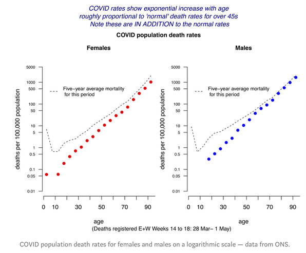
The amazing linearity of the data on the logarithmic scale shows that COVID rates have a fairly precise exponential increase with age, increasing at around 11–12% each year, corresponding to a doubling every 6–7 years. This means that a 20-year age-gap increased the risk by around 8-fold. So, compared to a 20-year-old, an 80-year-old had 8 * 8 * 8 ~ 500 times the risk of dying.
Men had roughly double the risk compared with women of the same age.
[P]hrases like ‘the risks of dying from COVID-19’, [are] deeply ambiguous. [I]t crucially depends on the group it refers to, as it could mean
- The risks of dying from COVID-19, among people who get it (the Infection Fatality Rate IFR ).
- The risk of dying from COVID-19, among people who do not currently have it (Population Fatality Rate PFR).
These are so easily confused.