
We had a gentle argument at work about font choices, serif and sans serif.
I discovered later that what we were really arguing about is a difference between legibility and readability. Legibility describes how easily we can distinguish one letter from another. Readability measures how easily we read words, phrases and blocks of text – more about pattern spotting than about distinction. ¹
Arial 14pt
Lorem ipsum dolor sit amet, consectetuer adipiscing elit. Vestibulum bibendum, ligula ut feugiat rutrum, mauris libero ultricies nulla, at hendrerit lectus dui bibendum metus. Phasellus quis nulla nec mauris sollicitudin ornare. Vivamus faucibus. Class aptent taciti sociosqu ad litora torquent per conubia nostra, per inceptos hymenaeos.
The term readability rather is used in ways that suggest that familiarity with a font breeds ease – up to a point, presumably, at which switching to some other font is shown to be more comfortable. Ease may even vary with the way you do reading. Claiming that people read best what they read most would be true if you have few alternatives. Clearly not an easy thing to study? I wonder. We could test reading a novel printed in different fonts and switch between copies; we can switch fonts and pages on a screen quite easily. Maybe there’s a perceived difference between paper and screen-based fonts. This idea of familiarity feeds an argument that says whatever issues there are with ‘new’ fonts will go away as they are seen more often.
I have put some fonts on which you may opine over in the right hand margin.
Times New Roman 16pt
Lorem ipsum dolor sit amet, consectetuer adipiscing elit. Vestibulum bibendum, ligula ut feugiat rutrum, mauris libero ultricies nulla, at hendrerit lectus dui bibendum metus. Phasellus quis nulla nec mauris sollicitudin ornare. Vivamus faucibus. Class aptent taciti sociosqu ad litora torquent per conubia nostra, per inceptos hymenaeos.
Verdana 14pt
Consectetuer arcu ipsum ornare pellentesque vehicula, in vehicula diam, ornare magna erat felis wisi a risus. Justo fermentum id. Malesuada eleifend, tortor molestie, a fusce a vel et. Mauris at suspendisse, neque aliquam faucibus adipiscing, vivamus in. Wisi mattis leo suscipit nec amet, nisl fermentum tempor ac a, augue in eleifend in venenatis, cras sit id in vestibulum felis in, sed ligula. In sodales suspendisse mauris quam etiam erat, quia tellus convallis eros rhoncus diam orci, porta lectus esse adipiscing posuere et, nisl arcu vitae laoreet.
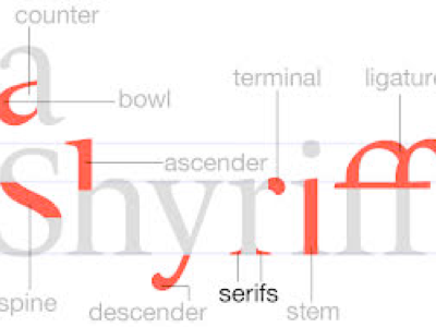
A serif font has the little details (serifs) that dress up the letter; look at the s of serif; look at the way many letters like rtifghjklzxnm emphasise the placement of the line on which they appear to be written, how the dangling parts (descending, the descenders) of qypgj and the raised parts of tdfghjklb emphasise where they finish by the few extra pixels.
It is said² (by whom, pray?) that serif fonts are readable and sans serif are legible. Popular serif fonts are Times New Roman [this, here], Palatino, Georgia, Courier, Bookman and Garamond. Sans serif fonts include Helvetica. Yet John Wood indicates that it is the sans serif fonts that are more readable, especially on a screen. He states that the serif fonts are great for catching the eye, making a point – and therefore good for notices, titles and emphasis. Where the point is to allow the reader to grasp the meaning of the text rather than the text itself, then readability is key. One of the common observations is that pixels per screen will make a difference to legibility.
Legibility - it looks good, whether or not you choose to read it. Legibility is then the term used to gauge how much you like the look of a font on a page. That then suggests to me that the manipulation of space may well be an issue.
Readability - the ease with which you can absorb the ideas made by the writing. So perhaps we should test this by measuring not words per minute but ideas per unit time? I notice in my own work that while the use of double justification adds to legibility it reduces readability.
When we look at how we do reading, people who read quickly—let’s say over 500 words a minute—are scanning rather than looking at each letter. They are indeed barely looking at each word but at the patterns that large blocks of text indicate. If reading a newspaper column, a fast reader (‘speed reader’) will force the gaze down the middle of the column and absorb meaning at high speed. It is, at least at first, a trade between speed and detail. In most newsprint, that is a good deal. With practice, one changes the speed to match the information contained, trying to match information input speed, ideas per minute, not words per minute.
There is some interesting research. Quoting John Wood, ³
A 2002 study by the Software Usability and Research Laboratory concluded that:
1. The most legible fonts were Arial, Courier, and Verdana.
2. At 10-point size, participants preferred Verdana. Times New Roman was the least preferred.
3. At 12-point size, Arial was preferred and Times New Roman [TNR] was the least preferred.
The preferred font overall was Verdana, and Times New Roman was the least preferred.
He goes on to say:
So here are your marching orders:
For easiest online reading, use Arial 12-point size and larger. If you're going smaller than 12 points, Verdana at 10 points is your best choice. If you're after a formal look, use the font "Georgia." And for older readers, use at least a 14-point font.
I feel vindicated. ⁶ My 2010-2017 website used Arial at 14 point and I think is now at 18pt; I binned TNR simply because I can’t read it easily. I even dithered with Verdana, which is one of the Apple defaults. I dislike Courier only because it looks so much like my mother’s old typewriter face. I discovered (2023) that much of this site has switched to Helvetica Neue at a larger size where I had been working with Arial 15. I've switched this page back to Arial 18, as explained below.
I am amused to read from Joel Falconer that if you set your machine preferences to sans serif in lieu of specific font names then Mac users will see Helvetica while Windows users see Arial.
Looking for research into this issue brings one to Colin Wheildon – or in my case, a sudden loss of access to the net as Safari fails to open pages.....try here for an Ahern commentary. Wheildon ran some proper testing in North America, looking at the printed word. He showed that average readers comprehend a serif typeface more easily. Reasons for this are guesses. He points to some work done in Britain by the Medical Council way back in 1926 where the point was made that the collected blank spaces set up some sort of brain response, ‘light vibration’, which serif fonts tend to reduce. There is thus an argument over stuff that is to be looked at and stuff which is actually going to be read. That directly means that producers of magazines are going to emphasise any efforts that make the page look attractive, on the grounds that this might make you buy it (where readability might be a reason to buy it regularly because you actually read the content, not merely look at the pages). That in turn says that publishers of books would be chasing the readability primarily. There must be a growing body of information available to the providers of e-books – especially where they are collecting feedback automatically with the permission/co-operation of the customer. For example, my own reading on the iPad(s) has settled on black print on a white background (I tried many settings and this is the most comfortable), in Seravek (a linear sans serif) at what I think is 14 point. It is, sadly, $225 to buy and $75 just for the basic font set, so I’ll use it to read, not pay to write with. I suggest we need some general tests for readability – an index, classification system or similar.
There is another meaning of readability, referring to the ease with which words can be comprehended, or reading ease, or a mark of a readable style. I’m writing here about the issue of what font to choose and why. So any research needs to be comparing the readability of very similar text. Generally my writing is not easy to read; I put words in unusual combinations because I’m chasing a particular meaning (or to make you read what I wrote not what you thought I wrote) and I use repetition to try to tease that point into your consciousness.
The text I use (when writing this in 2014) is as black as I can make it, in Arial at 15 point, with a line spacing of 1.1 or 1.2 (it varies, despite my several attempts to bring conformity). I set the margin at 1 point, use left justification (I don’t like double-justified much, but it looks better, even though it is not so easy to read; I even sometimes change the word order to make the justification less intrusive). I use brown (mostly, but also and purple, technically plum, cayenne or sometimes maroon) when quoting from others, often reducing the font size a tad and often leaving the text in the font in which I found it. I try to use a strong blue for editorial comment and decided in writng this edit in 2018 to switch the colour of this paragraph. Similarly I have recently decided to switch footnotes such as ⁷ only in red to help them stand out, since I cannot find an acceptable way to allow them to act as GOTO statements. When I remember to tick the check box in (iWeb and in) Sandvox links should open in new windows, but I find that difficult to remember do and harder to keep as intended. I spend quite a lot of time going back over old work and returning it to whatever is my current perception of the intended consistency.
DJS 20140111
Re-reading this in 2023 I discovered that I could confirm the font, the size or the spacing. Discovered how and I have switched this page from Helvetica Neue, the default on Macs, back to Arial 18px *where I've often used 17px. Inspecting the element of this little patch of text it is another way to check this. Swiching to Arial sorts out the pkine spacing that has been bothering me, since I prefer it a little closer than the Mac default.
1 Read Allan Haley on the subject at
http://www.fonts.com/content/learning/fontology/level-4/fine-typography/legibility
Haley is Director of Words & Letters at Monotype Imaging; he knows of which he writes, and he writes a lot.
2 http://www.awaionline.com/2011/10/the-best-fonts-to-use-in-print-online-and-email/
3 John Wood http://www.awaionline.com/2011/10/the-best-fonts-to-use-in-print-online-and-email/ It was this that led me to 2002 study by the Software Usability and Research Laboratory
4 Who shot the serif? http://ilovetypography.com/2007/08/26/who-shot-the-serif-typography-terms/
5 Colin Wheildon http://alexpoole.info/wp-content/uploads/2012/03/Wheildon-1990.pdf He uses the tern reading gravity, which I think refers to the way illustrations drag the eye to corners of the text (or don’t). Much of his commentary and discovery tells me that many people actually don’t read well, but their experiences tell us what we might do to help drag the eye to places where we have more content. Particularly, he points to the loss of understanding where reading gravity conflicts with significant content (in his case, things he included in the associated comprehension test). The link refers to work done in 1990, and half the readership complained that the sans serif font made the text difficult to read.
The iPad offers these, shown here at 18pt. Three are on my big machine and three are not.
AaBbCcDdEeFfGgHhIiJjKkLlMm NnOoPpQqRrSsTtUuVvWwXxYyXx AaBbCcDdEeFfGgHhIiJjKkLlMm NnOoPpQqRrSsTtUuVvWwXxYyX AaBbCcDdEeFfGgHhIiJjKkLlMm NnOoPpQqRrSsTtUuVvWwXxYy AaBbCcDdEeFfGgHhIiJjKkLlMm NnOoPpQqRrSsTtUuVvWwX AaBbCcDdEeFfGgHhIiJjKkLlMm NnOoPpQqRrSsTtUuVvWw

This is Iowan Old

This is Charter
Georgia, QWERTYUIOPASDFGHJKLZXCVBNM qwertyuiopasdfghjklzxcvbnm
Palatino QWERTYUIOPASDFGHJKLZXCVBNM qwertyuiopasdfghjklzxcvbnm and
Times New Roman QWERTYUIOPASDFGHJKLZXCVBNM qwertyuiopasdfghjklzxcvbnm;
6 I typoed vinidicated; this is the justified drinking of wine, when you have earned it. If doubly justified, you’ll have to use a straight-sided glass. If unjustified, you will wobble at the edges.
I wrote about style in footnote 8 to essay 172, as used by me, though this may change.
7 You thought I'd miss that one, didn’t you? I’ve also switched from using 7 and then making it superscript, to directly using the superscript character, ⁷, which I keep in some sort of Favourites in what Apple (OS X) calls the Character Viewer.
Added 201608:
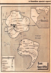
Readers may not have come across the island group of San Serriffe in the Indian Ocean, shown in the inset map. This was reported in 1977 in a special report from the Guardian. I post here a link to the front page of what I think was a 7 or 8 sides of content and advertising.
Observant readers may see a connection with the Panorama (British tv documentary programme) report of 1958 on the spaghetti harvest in Switzerland. Link.
20171214 update. Sandvox doesn’t share with me what the line height is, nor the margin. This information is hidden somewhere in the CSS (the control code for the script reproduction) and I have yet to discover where that is kept. I will discover this eventually, but meanwhile it makes the whole site less inconsistent. Indeed, I am generally looking at what I did with iWeb and (still in general) copying the choices of colour over, but not the font size changes. Apparently the term readability also applies to consistency of formatting. I have tried to make all quotes in brown and I am generally using fewer changes of font size, though I disagree with the expert (darling daughter) that this is irritating; I think it is a subtle hint generally not noticed.
