
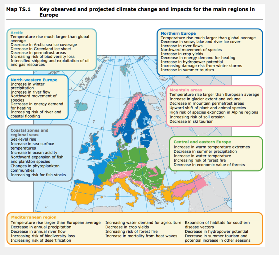
Okay, did you read it? No, the IPCC 6th report? No, of course you didn't. Instead you've let the gusty breath of all those media writers take the place of individual responsibility. Instead of reading it for yourself, you've taken on board the secondhand version as pushed by whatever individual interests are represented by the individuals you read. And that's just me criticising myself.
The report is remarkable for the lack of caveat. Where previous such reports use 'may', 'might', 'can' and 'could' and similar weakening words, this one hits right between the eyes. It is our fault; we did this. Further, it isn't going to fix itself and if we do nothing it is us, humans, that are set for extinction and being in the list of missing species. Phrases like 'high confidence' and 'likely range', along with a lot less waffle (than is usually seen in reports like this) and many more direct irrefutable statements (yes, we said that) make for a report that actually makes a point and demands some attention. Not that this means it will get what it needs; no doubt between now and the Cop26 meeting in Glasgow (Nov 2021, not immediately) there will be all sorts of vested interests making sure that the definitive statements are pooh-poohed and so dragged into the morass of not-quite-certain material.
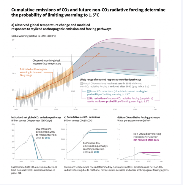
Take this first slide as example; look at the lowest of the three upper projections with the grey between them. This is the most proactive model projected, which has us reducing CO₂ emissions immediately and hitting zero between 2040 and 2055 (the two lines in the three lower graphs). There is an implication that a 1.5ºC global temperature rise is acceptable somehow (I don't think that is true), that it is inevitable (I think true) and that it is a reversible position (and there's the rub, because I think it is largely irreversible). Yet this summary chart declares quite clearly that the faster we act (the sooner we reduce to zero emissions) the more likely it is that we have a recoverable position — one in which we can limit warming to 1.5ºC.
Let's look at what that 1.5º rise means and just take it as understood that more rise means rapidly worse change and some of those changes are irreversible within the foreseeable future of say another century. Section B of the summary looks at the changes expected if 1.5º nudges up towards 2º and it is not a pretty picture. The hot days become hotter still, by about twice whatever the rise of the global mean is; if a hot day in London was 30º then after a 1.5º rise, that 'hot' will typically be 33º. Basically, whatever extremes of weather there are, they pretty much get worse as the mean temperature rises.
If you read the IPCC report at length, you will find that the bulk of the content is underlining what 1.5º and 2º rises imply in terms of effect and I see this as bulk persuasion that underlines how unacceptable 2º is, but by implication that 1.5º is acceptable. I conclude that the supervising authors have decided that 1.5º is a manageable goal requiring 'immediate' action and thus is one they think they can use to kick politicians into recognition that delaying action is a very Bad Thing, pointing instead at a 2º rise as a result. So, my reading (most of a day, in the end) came up with the conclusion that the authors as a body need to get across that this is bad and that delaying action will be markedly worse, so they have spent much effort in showing how much worse the 2º result is than the 1.5º one. By implication, and indeed many of the papers and charts support the suggestion, 1.5º rise is a target we just might succeed in achieving.
What will change? As I read the conclusions, more of the same bad stuff. High highs, low lows, more extremes of everything, both droughts and floods for example. Nor should we think that curbing the excessive CO₂ in the atmosphere will cause matters to reverse in any immediate sense. Indeed, they may not reverse in living memory.
While the high temperatures will rise by double the mean, the height of lows will rise by three times that, which will have particular consequence at high latitudes. So among the high-confidence statements is that the extreme cold nights near the poles will be 4.5ºC warmer than previous figures at a 1.5º mean rise. That suggests to me that the loss of high altitude ice is going to continue apace.
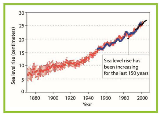
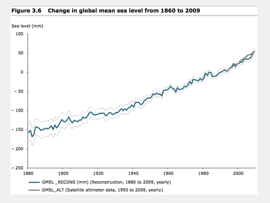
So, for example we can expect the sea level to rise by 26-77cm above the 1986-2005 mean by 2100 and that we should expect this to continue to rise. At 0.5º more of a rise, add another 10cm. I'll explain what effects these apparently small changes have in a while, but for now think of 10cm extra rise affecting another 10 million people directly. We should expect multi-metre ocean rise over the next few centuries, because once the ice has gone, there is nothing to cause it to return; it is the albedo of ice that keeps it in existence and once gone, the ground warms up enough to cause new ice to form only with difficulty.
We can expect a loss of biodiversity. See B.3. The changes (losses expected) in geographic range for insects, plants and vertebrates basically doubles as we move from 1.5º to 2º change. That is before we account for forest fires and invasive species. We should expect a change of ecosystems for around 5% of all land at the 1.5º mark, but three times that at the 2º mark. We should expect to lose tundra and to lose the permafrost, probably permanently. That of course will release more captured gases as this ground warms and that will itself accelerate change and make any return all the more unlikely. At the moment the prediction is for one ice-free Arctic summer by 2100 and one per century if the temperature rise is held to 1.5º. At 2º the modelling says that happens once per decade. Sea ice can recover in ways that land ice cannot. While all the melted ice should lower salinity, all the released CO₂ should raise sea acidity, which further encourages warming, such that we cannot ignore the effects of warming upon the oceans. We should expect the available catch to drop perhaps drop by double at the 2º figure. B.4.4.
[In the same way that I suspect some Brits will be saying to themselves "Hey, so we become like Spain, that sounds good", so in much the same way, those living in Russia will be thinking "All that lovely land in the north will at last become usable!" I'm not saying they're wrong, but do they really want such wholesale change? So much of what we do is predicated upon a large degree of the world having predictability. It also takes no account at all of the effects of all the displaced people. Peoples. But then we already know there are too many of us.]
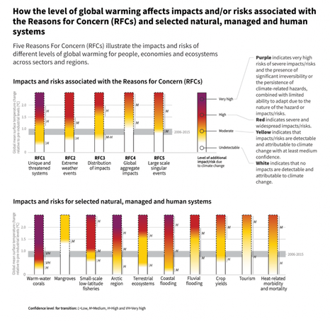
Section B.5 relates to changes in food supply and underlines—as if you needed any more underlining— how much worse things will be at the 2º model over the 1.5º one and just this change causes all the major risks to jump a level at the extra half degree mean rise. In short, however bad a 1.5º rise is, a 2º rise is very much worse, typically two or three times as bad by whatever measure is applied. Thus we have the second diagram, inset. Each reason for concern (RFC) impacts people, economies or subsystems. That table shows (I think) that whatever we identify as a recent change continues, only more so. The lower panel relates to systems we might identify with. Note the fluvial and coastal flooding, please, as this has a major impact of the numbers of affected people, who will then want/need to move.
____________________________
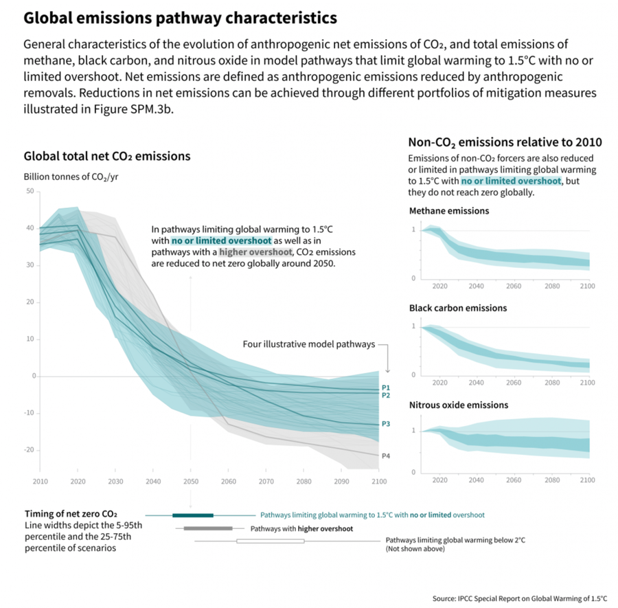
C.1. In model pathways with no or limited overshoot of 1.5°C, global net anthropogenic CO₂ emissions decline by about 45% from 2010 levels by 2030 (40–60% interquartile range), reaching net zero around 2050 (2045–2055 interquartile range). For limiting global warming to below 2°C CO₂ emissions are projected to decline by about 25% by 2030 in most pathways (10–30% interquartile range) and reach net zero around 2070 (2065–2080 interquartile range). Non-CO₂ emissions in pathways that limit global warming to 1.5°C show deep reductions that are similar to those in pathways limiting warming to 2°C. (high confidence) (Figure SPM.3a) {2.1, 2.3, Table 2.4}
Wow: We act immediately (no, sooner than that) so that at 2030 CO₂ levels come down fro 2010 levels and then we reach net zero by 2050 and we STILL hit a 1.5º mean rise? That's what it says. It goes on (at some length, but it should) to describe the mix of measures considered in the (many) models, be that lowering energy consumption, how we sequester carbon or the extent to which we remove atmospheric CO₂. Many of these models —and at this point we're restricted to those that 'make' the target—also include dramatic reduction in black carbon and methane, something like 35% of both of 2010 figures by 2050. C.1.2. That of course includes the cooling aerosols (GCSE students should quote some of these, cold). I can see that NOx and perhaps SOx would be in a similar position, a demanded and dramatic reduction.
C.1.3. Limiting global warming requires limiting the total cumulative global anthropogenic emissions of CO2 since the pre-industrial period, that is, staying within a total carbon budget (high confidence).
DJS 20210814
This may take a whole 'nother page to get one's head around. The budget figure—and let's assume we accept that there is one we must follow and that this is the right way to scale it—functions in gigatonnes of CO2, GtCO₂. I am far from sure I understand what is meant by budget and the number are all very large, but so are the uncertainties. My cursory read (and I'll try again) said to me that this would be a matter that all the politicians would simply shut out, in a 'heard but not heard' sort of way. Come back to this and try again. Meanwhile, look at the third diagram. I'm sure politicians will look at this as a menu, one from which they can choose actions. The rest of the world will be saying something like "No, do all of the above; just make something (good) happen". See Chapter 2 of AR6. Take particular note of model P3, which is the model I bet the politicians will root for, the least change by them. What we'll end up with is the least actual action required to meet the given target in a very just-in-time way. Cynical - me?
What is meant by the terms is that net zero is when we have reduced CO₂ emissions to the point where we collectively have no net effect. That is not removal of excess, just balancing our own effect so it becomes no worse than the outputs at a pre-industrial time. Such action may include carbon dioxide removal (CDR in the report), which we might also call carbon capture and similar terms. The budget of carbon is that total of effect by us, our anthropogenic activities, up to the moment of net zero, which means, I think, the load of carbon we will have added to the planetary ecosphere. It is this total that governs how much additional warming occurs, so the sooner we reach net zero (or even some negative output of carbon), the less additional heating we cause. Thus the remaining carbon budget is what is left, according to the modelling; the models predict a scenario that reaches net zero, which is allied to a total carbon load which leads to a total mean temperature rise. So, in a circular sort of way, if we wish to limit the rise to 'only' 1.5º, we have to reach net zero sooner (than for bigger rises), which in turn lowers the 'budget', the amount of carbon (CO₂) we 'allow' the system to peak at.
Separate action: to read the detail referred to in C.2.5 about changes in land use, which muddles the position wonderfully. C.2.5. Transitions in global and regional land use are found in all pathways limiting global warming to 1.5°C with no or limited overshoot, but their scale depends on the pursued mitigation portfolio. Model pathways that limit global warming to 1.5°C with no or limited overshoot project a 4 million km² reduction to a 2.5 million km² increase of non-pasture agricultural land for food and feed crops and a 0.5–11 million km² reduction of pasture land, to be converted into a 0–6 million km2 increase of agricultural land for energy crops and a 2 million km² reduction to 9.5 million km² increase in forests by 2050 relative to 2010 (medium confidence). Land-use transitions of similar magnitude can be observed in modelled 2°C pathways (medium confidence). Such large transitions pose profound challenges for sustainable management of the various demands on land for human settlements, food, livestock feed, fibre, bioenergy, carbon storage, biodiversity and other ecosystem services (high confidence). Mitigation options limiting the demand for land include sustainable intensification of land-use practices, ecosystem restoration and changes towards less resource-intensive diets (high confidence). The implementation of land-based mitigation options would require overcoming socio-economic, institutional, technological, financing and environmental barriers that differ across regions (high confidence)
I have no good idea what abatement costs are, nor marginal ones.
I left section D alone, at least for now. Enough already...
[1] https://www.ipcc.ch/sr15/ Yes, this is the AR6 report itself. If nothing else, read the summary. For yourself.
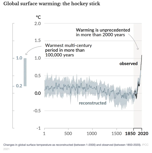
[3] https://theconversation.com/why-eye-catching-graphics-are-vital-for-getting-to-grips-with-climate-change-165983?utm_medium=email&utm_campaign=The%20Weekend%20Conversation%20-%202030919968&utm_content=The%20Weekend%20Conversation%20-%202030919968+CID_831d91cf2ba7a7bfd5e8d2364ed726bf&utm_source=campaign_monitor_uk&utm_term=save%20the%20planet the Hockey stick curve, in an article really about 'better' graphics.
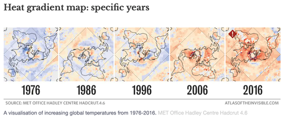
[4] IPCC atlas. https://interactive-atlas.ipcc.ch/ worth a play. I'm not convinced it tells you a lot, but for the general message that this is very bad and perhaps past time to act.
You'd think, offhand, that a rise of, say, half a metre in sea level is nothing much. That's the amount of rise if the many small glaciers disappear. (Chart, source). If we lost the big sheets of ice in Greenland, more like 7 metres. If we also lost the bulk of what's in the Antarctic, try a total effect of more like 65 metres.
Let us recognise that sea levels are 20cm higher than in 1850 and let's consider a further rise of only 50cm. See AR6 3.6.3.2, 3.3.9 and 3.4.4.8 onwards, which explain. 50±.23 cm sea level rise is the prediction at 1.5º additional warming. Obviously, sea level rise affects small islands, estuaries coastal cities and all low-lying land. We should associate sea change with other factors such as salt-water effects, changes in salinity (and ocean chemistry), increased storms and greater run-off leading to even more flooding, especially when rainwater meets higher seas. Table 3.3 indicates that a further 20cm rise (2050) affects some 574 thousand km² (±23) of land, some 135 million people affected (but think 'displaced'). For a 40cm rise the land rises to 620 thousand km² and the people about the same but with bigger variability so think 'displaced' more definitely. Particularly affected is the low-lying land bordering the Indian Ocean, including Kolkata, Mumbai, Surat and Chennai. At a metre of sea rise, the affected is around 1.4 billion people, which just happens to be the size of the population of India.
So the indirect effect of sea level rise is (even) more migration. Loss of agricultrural land, loss of living space, dramatic change at the littoral edges, which is where we tend to live. I cannot help but think that one of our first reactions ought to be 'fewer people'. We are the problem; we reduce our numbers, we reduce the problem.
DJS 20210816
Why would we care that the IPCC report was 'released in Monaco'? How is that relevant? Top pic from the IPCC AR6 report's summary and is probably the very first chart. I will continue to hunt for an updated coastline image, more than what is shown in my earlier essay number 49 (2010 !!). Actually, I clearly failed to find what I'd hoped for then, too, even referring to earlier IPCC AR#5.
Here is one such, at https://www.floodmap.net (you'll be charged).
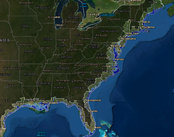
Here's another, https://coast.noaa.gov/slr/ just for the mainland US. I show a two foot (60cm) rise.
https://grist.org/climate-energy/the-16-scariest-maps-from-the-e-u-s-massive-new-climate-change-report/ If you want a set of charts to show a Geography class, start here. The sea level chart to the right here is from there, the link above.
https://www.eea.europa.eu/data-and-maps/indicators/sea-level-rise-7/assessment
You can find several maps that show the sea rise but the source of these is from Climate central and their map set titled surging seas. I show here the map for the area around my house with a 1 metre sea rise and confirm that the flooding on my previous house in the fens (10-15 miles outside Cambridge) would be, basically, on the new coast. But access this and play for yourself. If you're looking at unfamiliar coastline, try swapping to 30m additional sea level to identify where you would be interested in, and, having zoomed in (it's remarkably good) reset the depth to a reasonable figure like a metre or two. Anywhere; I suggest you look at the north end of the Adriatic (Venice, for example), at the Florida cape, at the Bangladesh coast, Karachi (on the other side of India), all of the Netherlands and Denmark, but also perhaps Buenos Aires, Cairo (Port Said to Alexandria), Qingdao, Hanoi (and Bangkok, Ho Chi Minh City, etc, for they're all at about the same risk). Do write with interesting observations and criticisms, especially if you find a(n even) better model to use.
7317/-2.5667?show=satellite&projections=0-K14_RCP85-SLR&level=5&unit=feet&pois=hide
Assembly idea for the very lazy: simply show the video, '15-minute graphic novel'. Here's a link. https://becauseipcc.thesuccession.ca/what-is-ipcc-and-what-is-ar6/?gclid=Cj0KCQjw-NaJBhDsARIsAAja6dOSLtIfy3P2ccCcP_RL6Fa-ntjv1-kzURAL-bdPK8Qt2u8g6xA35PkaAuVdEALw_wcB
https://becauseipcc.thesuccession.ca/because-ipcc-the-video/ I'm sorry, I think this might be fit for UK primary school, perhaps Y4-6. No doubt I'm wrong by most of a decade. Nip through the transcript to see what I mean.
Later: UN weighs in https://www.bbc.co.uk/news/science-environment-58600723